The concluding part of our series looking at the style and design of TV captions during the World Cup.World Cup 1998The French have a saying: 'plus ça change'. Roughly translated, it means 'the more things change, the more they stay the same.' This was a fair description of the captions seen during the 1998 World Cup, albeit with a little bit of animation thrown in for good measure.
Where USA '94 had been all about the blue rectangular panels that displayed informative text of all kinds, France '98 tweaked things slightly by using a blue ribbon motif and bulky lettering. Any names that were displayed showed only the surnames most of the time, but the captions appeared in the wake of a football that swept from left to right, leaving behind the text, a pinched-in-the-middle ribbon and a fluttering flag.
A similar look was applied to the captions for the scoreline and yellow/red cards. For the former, a timer was included in the top-right corner which displayed a small '1' or '2' to indicate which half of the match you were watching. A tilted yellow or red card floated onto the ribbon from foreground whenever one had been awarded by the referee.
As has been seen during previous tournaments, a degree of inconsistency was evident from time to time in the standardisation of the captions. During World Cup '98, substitutions were detailed in one of two ways. Some used upward and downward pointing triangles to show who was leaving and entering the field of play, while others showed a downward pointing arrow next to the name prior to the whole ribbon flipping on its horizontal axis. The reverse side showed the player being introduced, along with an upward pointing arrow. All very confusing in a pointy sort of way.
![]()
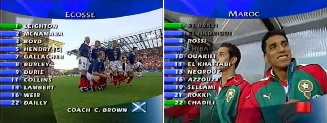
Every once in a while, the captions for this tournament broke the mould and indulged in a greater use of colour than was normal. Take the team listings, for example. Here, a series of three curved panels created a frame of sorts for the image lying beneath. On top of the panels were the the team name, the coach's name and the players in the starting line-up, all with a blue tab (or green, if you were the goalkeeper) showing the shirt number.
An almost identical caption was used to show the squad members that could potentially make an appearance as a substitute. In this case, any players that were unavailable to play had their names shown in dark grey.
An even more colourful set of captions were saved for the referee and his officials. In past tournaments, it was enough to simply show the surnames and nationalities of the people involved. At France '98, a curved panel at the bottom of the screen showed all of that on a patterned background in the colour of the officials' shirts, be they black, yellow or red/pink. A nice creative touch, and one that seemed sadly absent from many of the other captions.
The only other splash of colour was found whenever a penalty shoot-out came to pass. A strangely contrived panel was displayed to keep viewers up to date on who had scored and who hadn't, and on this occasion it was done with the help of green squares showing a football and a red square showing an empty goal net. All very graphical but a bit too overdone when you compare it to the simplicity of
the 1994 'Othello' approach.
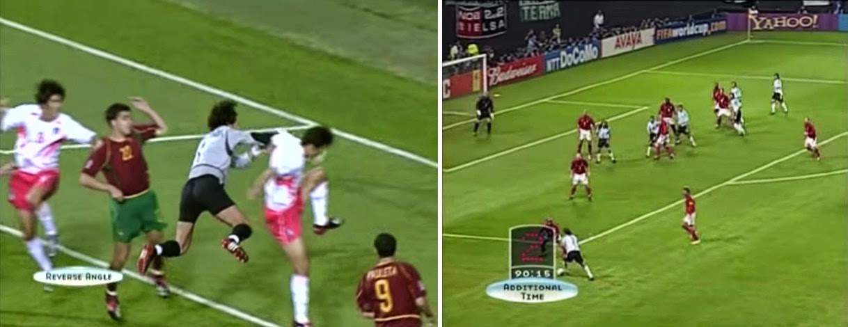
As for new innovation, that could be summed up in one word - 'Opposée'. That was the word accompanying a peculiar square-encased image of what looked like a CCTV camera that denoted a 'reverse angle' view of a previously seen piece of action. Possibly the most redundant of all football captions, given that most people can work out why the direction of play has switched, and the graphic hardly gave it any credibility either.
If this was the best that the 1990's could offer, it was probably time for a new attitude and a new millennium...
World Cup 2002Finally everything fell into place. Having embraced the potential for computers to jazz up the presentation of football on television back in the 1980's, we were now finally getting what was hoped for. The 2002 World Cup brought us some genuinely original design, dynamism, animation and a completely new look for a new era.
To be specific, this was the era of the lozenge. Gone were the boring panels and ribbons of the previous couple of tournaments. Now we had three-dimensional pale blue pointed shapes that showed the name of the team, the name of a player or the name of a coach. Many times they had a circular flag to the left with a beam of light rotating around it, and often there was an accompanying shadow-tinted panel to display additional information.
It all looked a bit like a FIFA video game, but perhaps that was no bad thing as a modernisation of TV's World Cup captions was long overdue. Chief among the most obvious visual changes was the font - a strange character set that used 'small caps' rather than 'all caps' or lower case to get the message across. Quirky it may have been, but it was certainly clear and readable.
In general, it's fair to say that this was the World Cup where the caption designers were given free rein to do whatever they liked, however they liked. Even the smallest of changes were worthy of mention, and there were many of them. On the team lists, for example, the goalkeepers had a small glove symbol displayed next to their names, and any players that had previously been awarded a yellow card were indicated accordingly too.
If you were lucky enough to catch an early sight of the local feed in Japan or South Korea prior to the match starting, you'd have seen a myriad of different captions telling you about the climatic conditions at the stadium. This level of information had been dropped for France '98 having been seen occasionally in the two World Cups prior to that, but here it was, back again, with icons galore for wind speed, weather, temperature and humidity.
There was even room for a degree of creativity whenever a substitution was made. Here, a caption showed the name of the player leaving the field alongside a stylised red arrow on a 'lozenge', his replacement's name displayed below on a shadow panel. As the new player entered the field of play, the lozenge swivelled round on its horizontal axis to show the two names had switched places and a green arrow indicating the oncoming substitute.
This pleasant use of animation wasn't too overused throughout the competition, and in the main it stayed just about on the right side of gimmickry, in my view. Curiously, there were far fewer instances of a player's name being shown during idle moments of gameplay, unless the player in question was injured or receiving a card of one sort or another.
World Cup 2002 saw the return of the 'reverse angle' caption in the form of a Viagra tab in the bottom-left corner of the screen, but a new 'Additional Time' version of the same showed an electronic board standing proud with the number of extra minutes illuminated on it. Clever stuff.
As ever, the most eagerly awaited use of graphics in the full set of captions was saved for the penalty shoot-outs, and here we saw a simplified, more intuitive version of what went before in 1998. Instead of balls, goal nets and squares, this time we saw the return of the 1994 spots, this time coloured in red and green to show goals scored and not scored. No ambiguity, no complications - just a nice visual that typified this whole collection from 2002.
World Cup 2006Inevitably, things got very corporate by the time World Cup 2006 came around. The styling and branding of the official FIFA website transferred itself seamlessly to the TV captions, but that wasn't necessarily a bad thing in retrospect. Any lack of free thinking was certainly made up for in clean-looking text and even more polished graphics.
Where Japan/Korea 2002 had lozenges, Germany 2006 had breadsticks - grey ones that showed the key information above a returning set of shadow panels for extra data. The breadsticks (believe me, I'm trying to think of a better way to describe them, but am failing) almost always had a curved flag to the left that seemed to swoop over the top from an indiscriminate point behind. The flags looked nice, although their 'swooping' nature suggested someone in the design department was trying a bit too hard to break free of the rectangular/circular flags seen before.
![]()
Broadcasting standards had improved to such an extent that HD TV was now becoming more widely available, and that meant greater clarity when reading the text and more picture space for those with widescreen televisions. All of that would come in handy for reading the extra information that was being displayed on screen, indicating how many goals a player had scored in the tournament or how much possession the teams had had so far - even the miniature digital boards shown next to the names of the fourth and fifth officials.
Slight variations on previously used themes could be seen throughout the tournament in Germany. Substitutions, for instance, improved on the 'rotating lozenge' method used in 2002 by having the two names rotating as if on rollers when the two players exchanged places. Again, both names swapped over - one roller, or 'breadstick', if you will, giving greater emphasis to the player leaving or entering the field of play.
![]()
Furthermore, the awarding of a second yellow card to a player resulted in a small animation showing a second yellow rectangle appearing next to the first before merging into a single red one. Once again, only a small thing, but beautifully executed.
The final example of a slight enhancement of the previously acceptable captions of 2002 was seen during the four penalty shoot-outs of World Cup 2006. Again, the red and green dots were retained (looking more like lights this time) but now they were shown below the team names rather than alongside them.
Whether they look better that way is a matter for personal opinion, but either way, they, and all the other captions, again looked very slick and very easy on the eye, as one would hope and expect them to be.
World Cup 2010And so to the most recent collection of World Cup captions in which all the graphics from 2006 were given an orange coat of paint and everything else remained virtually the same as it was.
Well not quite, but nearly. The breadsticks were back, albeit with their ends cut on the diagonal and tinted pale orange; the font was almost the same, but the flags no long swooped. Instead, they were stuck near the end of the breadsticks in an artistic, slanty fashion.
Gone too were the shadow panels that were used for supplemental information. They were now replaced with a metallic orange equivalent that had an ornate and curly design incorporated into them. Such a fancy way of doing things had now become the norm in other tournaments, most notably
Euro 2004 and 2012.
That bright orange background was most visible during the traditional 'team line-up' sequence which now, finally, allowed the viewer to see the players in their correct formation - something that hadn't been seen since the captions of the
1966 World Cup. And there was also a welcome return to the fluttering flag - now displayed on a bigger scale than ever before.
Aside from the visual appeal of the many and varied 2010 captions, there was also the manner in which they appeared on the screen - namely 'from out of a golden beam of light'. It was this yellowy glow that occasionally spread across the lower part of the screen before turning into a gold bar capped with brushed metal tips and then transformed again into the fully formed scoreline or whatever the caption happened to be.
There wasn't a whole lot of other animation on show during the tournament. Granted, the awarding of a second yellow card brought forth a sequence where the yellow card next to a player's name divided into two, whirled around and changed into a red card, but that was all silly nonsense, really.
Essentially, World Cup 2010 brought us a more refined version of the sort of thing we saw in 2006. Sometimes there were statistics for 'shots on goal' and 'possession' - inevitably becoming more important even than the players' names, a lot of the time. The breadsticks still revolved when the players changed places. And the penalty shoot-outs? Well now it was green and red ticks and crosses instead of spots.
Oh don't get me wrong - the captions all looked fine in their own way, but now it was more apparent than ever before that we'd reached the end of the line where expansive, original design was concerned. From here onwards, it'll be corporate branding all the way, keeping 'on message' with the rest of FIFA's marketing department. No more funny fonts, no more colourful flag plinths or video windows showing the players in the team. If it hasn't been designed to within an inch of its life, it isn't going to be seen during any future World Cup.
And that's kind of sad, in a way. No matter how basic the technology available at different times in the past, the caption makers have always found a way to innovate and break new ground from time to time. Now it seems, their work is done.
If you like well designed graphics, you'll no doubt still get them when the 2014 World Cup begins next month and every four years thereafter, but will they make you smile? It's difficult to say so, but I very much doubt they will.
See also:FIFA World Cup - In captions (Part 1)FIFA World Cup - In captions (Part 2)


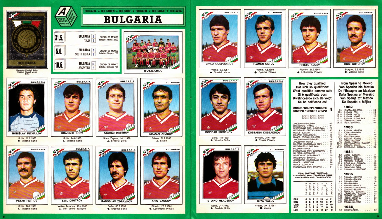
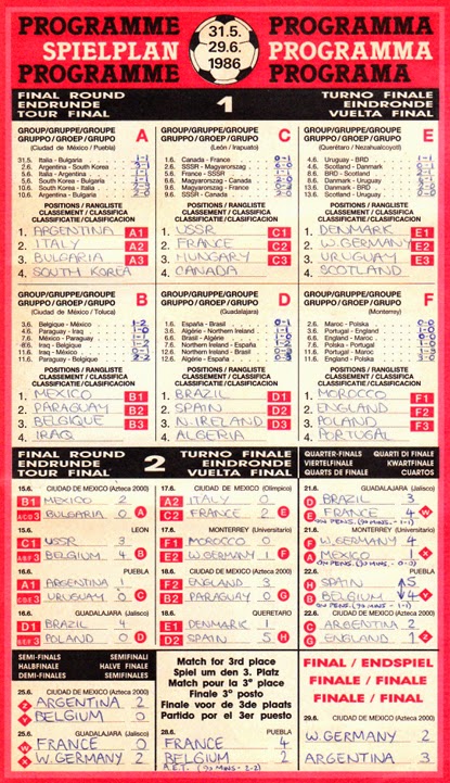
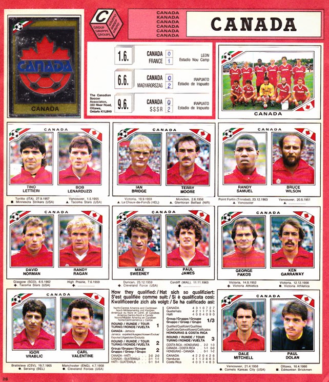
 Stickers showing each of the official World Cup posters appeared in perfunctory fashion on page 2 while the stadia and city locations for all the matches in Mexico were shown on pages 3, 4 and 5. After that, it was onto the players, almost always displayed in their teams across two pages, although South Korea, Iraq, Canada, Algeria and Morocco were deemed less important and had to make do with one. As ever, a team picture sticker and foil badge were present for each of the competing nations.