Quantcast
Channel: The Football Attic
Viewing all 451 articles
Browse latest View live

The Greatest Retro Football Video Game Ever - Final result

$
0
0
After nearly a month of voting, we can now finally announce the winner of our contest to decide The Football Attic's Greatest Retro Football Video Game Ever... and here's how you voted!

Yes, friends, you've voted Sensible Soccer to be the top retro football computer game of all time, comprehensively beating Football Manager with almost three quarters of all the votes cast in the Final.

Over the last week, only one winner ever seemed likely, although Kevin Toms' management sim had Sensible Soccer on the rack for the first couple of days. In the end, however, it was the playing sim that stormed through to claim its place in the Football Attic Hall of Fame as your favourite football video game title.

Our huge and sincere thanks to all of you that took part in our vote-off from start to finish. It's been great fun seeing who you've been supporting during each round!

And now, let's remind ourselves of why Sensible Soccer is such a worthy champion... Once again, many thanks to you all!


Help Fight Cancer & Win a Kit Collection Book!

$
0
0
Earlier this year, Rich finally got round to photographing his ridiculously large kit collection. He then spent far too much time creating a photobook of them all (reviewed here by kit book legend John Devlin).
It was limited to a run of about 20 books and they sold pretty quickly so if you wanted one, alas it's no longer available...however...

We have a special copy to give away...sort of...

Rather than just make this a competition, we thought we'd do something good and raise some money for charity and sticking to the football theme, we've chosen the Bobby Moore Fund for Cancer Research UK.

To this end, we've set up a Just Giving page to make the process nice and easy.

All we ask is you make a £2 minimum donation. You can donate more if you wish - for each multiple of £2 you donate, you get an entry into the draw to win the kit book. So if you donate £6, you'll get 3 entries, trebling your chance to win...

The event closes on Sunday 14th December, after which we'll draw the winner and try and get it to you by Christmas!

Please leave some form of contact details when you donate so we can contact you if you win.

So...what are you waiting for? Get donating!

www.justgiving.com/FootballAtticKitBook


Panini: Football 82

$
0
0
Let's see who's looking through the... ROUND window...

Yes, Panini's 1982 collection featured players gurning, grimacing and squinting through a circular frame on many of its 516 stickers. It was the fresher look that the Football 82 album was based upon, although many familiar features remained throughout.

Once again, the front cover changed colour, this time using pale blue to top and tail a great action photo from a match between Tottenham and Manchester United. Though the picture was nicely composed, however, one has to wonder how many kids had sleepless nights over the thought of Sammy McIllroy's gruesome missing right hand.

Inside, the old double-page spread was employed for each of the English First Division teams, the major change this time being that the player biographies were now enclosed in two columns either side of the fold, rather than underneath each sticker. And then there were the new stickers themselves which now featured the name of the league and division in the top corners and a slightly restyled bottom section to show off the name of the player.


From Arsenal to Wolverhampton Wanderers, the bright new face of English football came shining out. Silky shirts with pinstripes, smart haircuts and smiles were all in plentiful supply as players old and new adorned Panini's pages. Check out Southampton's army of ageing greats such as Alan Ball, Chris Nicholl and Mick Channon - all comfortably in their thirties - situated a turn of a page away from Stoke's youngsters including Lee Chapman (20), Adrian Heath (20) and Paul Bracewell (19).


Elsewhere, we had our first ever sight of Swansea City in the First Division, along with Notts County who were back in the top flight for the first time since 1926. For Leeds United, however, this would be their last season at the highest level of English football until their next tilt at the League Championship came along in 1990.


The foil badges in Football 82 were spruced up in all their gold finery with clearer lettering and a pleasantly contrasting silver border providing an improvement on the previous year's efforts. They added a decent splash of glitz not only to the First Division and Second Division pages, but also now the Third Division pages too, albeit in a half-size format. This meant your average junior collector was likely to get a rare glimpse of the impish Lincoln City badge or Reading's building society-esque depiction of some trees and a river.


For the Scottish Premier teams, two players yet again had to share a single sticker, although the manager of each team was now given one of his own in full size format, and again the Scottish First Division teams were each given their own team picture.


Yet apart from the opening 'Players of the Year' section that mirrored Football 81, there was no main feature showcased in the middle of the album. Granted, the 1980 FA Cup Final section in the previous year's collection wasn't the most exciting thing ever, but at least it provided a contrast to the usual 'badge-team-player' routine found on all the other pages.


Instead, the album closed with a tantalising message telling us to "Look out for Espana 82 - Panini's great World Cup collection" due to appear in shops in April 1982, and a back cover promotion for Subbuteo's six-a-side game, Top Scorer.


Despite continuing the high standards of previous efforts, it could be argued that with Football 82 Panini used the 'if it ain't broke, don't fix it' approach by barely straying from its tried and tested format.

But that, however, was about to change. For Football 83, some new ideas were set to bring a breath of fresh air to Panini's annual stickerfest, and for the more traditional fans, they may not necessarily have been for the better...


-- Chris Oakley


See also:

Got Not Got CCFC & Kit Book Review

$
0
0
Last year we reviewed the 2nd incarnation of the retro football bible, Got, Not Got and a few of the spin off titles that were starting to appear alongside it. There's no new version this year as instead, Derek & Gary have been busying themselves creating a wealth of club specific volumes, ranging from the giants of Man U and Liverpool, to the smaller, but no less loved clubs such as Norwich.

Falling neatly into that last category is The Lost World Of Coventry City.

This book holds a very special place in my heart, not only because of the team in question, but also because I was able to contribute lots of my own memorabilia collection to its hallowed pages. NB...most of the pics in this review might just well be of pages with my stuff on, cos...hey, it's my review ;-)

On top of that, anyone who's listened to our podcasts will know how often I've bemoaned the sheer lack of attention Coventry has had down the years, so to have an entire book all to ourselves is bliss!

Following the usual GNGLWoF format, this is just chock full of pretty much everything you could imagine that's ever been produced with the CCFC name on it, from the standard club programmes, Subbuteo & Panini, through the more obscure stuff like myriad pin badges and CCFC gnomes, culminating in what must be the nadir of Coventry City memorabilia, the Cup Final 7", "Go for it City".

OK, so the single itself may not be all that bad and of course, anything to do with that Cup Final will always be endearing to any CCFC fan, but the B side, "Go for it Cupid" (my heart, shooting to win) is possibly one of the worst pieces of music ever set down on vinyl!

There are pages dedicated to Coventry's kit manufacturers down the years including the iconic Admiral & Hummel and the possibly less remembered Ribero, covering the infamous chocolate brown kit and of course, the test card shirt from the late 80s.

As with every other Got Not Got book, the joy is not only in the sheer wealth of material covered, but also the depth of knowledge shown in the writing. If you are a Coventry City fan, you simply have to own this book and the same goes for fans of the other clubs who have also had the "Lost World Of..." treatment thus far,


The second book on review here is another that has me firmly within its target demographic. If I wasn't spoilt enough by a book all about Coventry, "Shirt Tales & Short Stories - The Lost World of Football Kits" is surely the icing on a book shaped cake.

Covering English clubs from Arsenal to Wolves, it also features a selection of Scottish teams and a page for each of the home nations.

Each team is given a double spread featuring several kits from their history, covering both much loved classics and also the ones some would rather forget along with text detailing the selections and a brief history of the clubs' shirts.

A large amount of the photos are from the vast collection of Neville Evans who runs the National Football Shirt Collection, and these lend a real air of quality to the book, with each of his shirts lovingly and professionally photographed.

As well as the shirts themselves, scattered throughout the book are kit adverts from the 70s, 80s and 90s as well as shots of the kits in use from the time.

As with the CCFC book, if you have any interest in football kits whatsoever, this is an absolute must! It may not cover every club going, but those that it does are given the VIP treatment...and of course, that means there's room for a Volume 2!

- Rich Johnson


Videoblog 6: The Encyclopedia of World Football (Marshall Cavendish, 1980)

$
0
0
Way back in July 2013 when we recorded our podcast on Football Books, Rich asked Chris whether there were any books he loved enough to warrant him running back into a burning house to rescue from its raging inferno. Chris answered that one particular title would be worthy of that life-threatening course of action, namely the Encyclopedia of World Football.

Sixteen months on, Chris finally tells you all why he loved the book so much in Videoblog 6 (see below). For fans of football kits, badges and general miscellanea, this is a great old book that's well worth hunting down on eBay and other online auction sites.


Whatever Happened To... Nasal Strips?

$
0
0
Tunes, it seems, are not the only thing that help you breathe more easily. For a short spell in the mid- to late-1990's, another ingenious device - some say a fad - proved just as adept at opening your nasal passages as the sweet lozenge of yore. Or was it?

Robbie Fowler was a Liverpool striker with an incredible talent for scoring goals, but one thing was letting him down - his ability to breathe in more air through his nose than he'd have liked. Despite the fact that his nostrils seemed perfectly capable of doing their job properly, he searched for a way to increase his 'intake yield.' *

What he found was the Breathe Right nasal strip, a "spring-like band" that sticks to the top of your nose and gently opens the nasal passages. For an all-too-brief spell back in the mid-90's, every athlete on earth seemed to be wearing one, all seemingly encouraged by their ability to take in more air during physical activity.

And so it was that Brer Fowler felt obliged to join the ranks of the world sporting elite who were decorating their noses with these funny-looking plasters. It was said that these nasal accoutrements improved air flow by 31% and even helped reduce snoring for those that were so afflicted. Sadly their introduction came too late to be tested on fans of Graham Taylor's England team, but their popularity was beyond question only a few years later and for many years hence.

As it is, there was much doubt poured on this revolution in assisted breathing, some claiming the whole thing to be complete hooey. Dr. Beat Villiger, a Swiss sports specialist invited by FIFA to test the viability of nasal strips, claimed that when the human body was really exerting itself, breathing usually switched from the nose to the mouth anyway, in order to pull in more air.

So in other words, the benefit of wearing one only became apparent if you were doing anything less than a full sprint. Or to put it another way, wearing a nasal strip was a way of telling people that you were so unfit, you needed a bit of help from a plaster to get you through 90 minutes of occasional exercise. Hardly surprising, then, that we don't see them worn much today.

That said, perhaps they just haven't been marketed right, or indeed aimed at the right people? For a device that gently opens up small apertures to improve performance, surely they could be worn on the anus to help TV commentators get more of their words out, or across the eye sockets to give World Cup hosting administrators a wider view of what's going on. Just a thought...

* Made up terminology.

-- Chris Oakley

Crimes Against Design: Shoot League Ladders

$
0
0
Where football nostalgia is concerned, there are few things that can rightly call themselves 'legendary' like Shoot's League Ladders. We've discussed them at length before and spoke of them in unashamedly exalted tones... but say it under your breath - certain elements of it were really badly designed.

Like the very best aspects of football memorabilia, perfection can be rendered cruelly unattainable due to an oversight in someone's artistic interpretation. An issue may arise with a detail so slight or insignificant, yet if it dealt with by a ham-fisted chimpanzee with sawdust for brains, it can quickly unravel all the good work done elsewhere.

In the case of those classic League Ladders, there was always one thing that bothered me as a kid that no doubt bothered many thousands of other young football fans too. It was those tabs. Not all of them - just the one or two here or there that for some reason weren't coloured correctly.

At this point, I call upon the Tottenham Hotspur fans of this world to answer one basic question: How annoying was it that for years the Tottenham tab was always coloured blue, just like those of Everton, Ipswich, Birmingham and sundry other blue shirt-wearing teams?


It was ever thus from the first Shoot ladders in 1969/70 right through to 1987/88 when someone at IPC Magazines finally realised that Spurs actually played in white. But Tottenham weren't the only offended party throughout the annual cavalcade of cardboard conviviality. Preston and Bolton also had a case of the blues for many years, when white would have been more appropriate.

A quick look at that original set from 1969 reveals other abnormalities. Bradford Park Avenue (confusingly shortened to 'Bradford' while their City neighbours played one level higher in the Third Division) were given a green-coloured tab. This smacked somewhat of laziness as Bradford Park Avenue had ditched their white shirts with green trim two years earlier in favour of their traditional white with red and yellow hoops. Hardly a fitting tribute for Avenue's last year in the Football League.


To add insult to injury, Orient suffered in a similar way that season too. Though famous for wearing red throughout much of their history (including the 1969/70 campaign), Orient wore blue for 20 years, but that all ended in 1967... so why the blue tab?

The colour blue was in fact the root cause of many tab-related Ladder issues of the 1970's and early 80's. Ask any fan of Coventry or Man City - they'll tell you that Shoot only used to have one type of blue ink, and it certainly wasn't the 'sky' variety.


There also appeared to be a glut of black ink doing the rounds for a long time, and it was often used in a bewildering number of situations. To explain, the general rule of thumb for designing each of the tabs went as follows:

  • Main/background colour of the tab = the predominant shirt colour for that team
  • Name of the team on the tab = the secondary colour on the shirt of that team
So far, so logical, but what happened with Watford, Wolves, Derby, Port Vale or Fulham? None of those teams played in black shirts (although who did?), so why not give Watford a yellow/red tab, or Fulham a white tab with black writing? It certainly wasn't unheard of for Shoot to make white team tabs (although the practice seemed largely reserved only for Leeds for a fair while), so why so many black ones?


In the mid-70's, it became particularly clear that Shoot had little idea which colours ought to be used for certain teams, and reserved the right to celebrate that fact in whatever way they deemed fit.

Southport in yellow and black? No way - Shoot says 'black and pink'! Crystal Palace in red and blue? Certainly not - Shoot says 'purple and white'! Northampton in white and claret? Nonsense - Shoot says 'dark lavender and white'! And so on, and so on...


Now you may be thinking that this is all futile nonsense of the highest order, but I'd put money on any number of young children writing to Shoot every year to ask why their team wasn't shown in the right colours. The act of identifying teams by the hue of their kit always was and always will be a key stage of every young fan's football education, so it's fair to say errors of this kind could have caused confusion on a massive scale. And we haven't even discussed teams that wore stripes and hoops yet.

What's done is done, however. Despite the ongoing cult worship of Shoot's League Ladders in the modern era, their legend-like status, based on the evidence above, is no doubt flawed much more than anyone ever realised. Then again, no-one ever kept their ladders updated for an entire season because we all got bored with them after a few weeks, so who said they were perfect anyway?  How the passing of time plays tricks with your memory...

-- Chris Oakley

With sincere thanks to Football Cartophilic Info Exchange for allowing us to reproduce the images shown.

The Football Attic's Top 30 Retro Football Twitter Accounts

$
0
0
If football nostalgia's what you live for, then indulging in your passion is what makes life so great - and where better to do that than on Twitter where the world is undoubtedly your oyster?

In the 33 months we've been on Twitter, we've marvelled at the huge community of people that share our love of football's magical past, whether their interest be focused on great players, great matches, great memorabilia or great football kits.

But with thousands and thousands of accounts to follow, which ones should you really be looking out for? The answer is not as difficult as you might think because we at The Football Attic have sorted the wheat from the chaff to bring you our list of the Top 30 Retro Football Twitter Accounts.

Here they are in no particular order, so enjoy - and get following!

1. @ChapmansArsenal
A delightful real-time account of all that was happening to Arsenal in 1930, full of period details about the players, goals and events from 84 years ago. Painstakingly crafted by Graham Sibley from The Sound of Football podcast.

2. @TheSkyStrikers
Photographic gems from an unending seam of match-day programmes are served regularly and with relish here. Lovers of 70's and 80's football will particularly delight in this eclectic parade of retro memories.

3. @ScotsFootyCards
A real giant on Twitter when it comes to classic photographs from a wide range of eras. Source material typically comes from Shoot magazine and Topps collector cards, but not exclusively so, and certainly not just for Scottish football fans!

4. @GoldstoneRapper
When it comes to single-club retro football accounts on Twitter, you won't find many better than this one, along with its accompanying blog site, The Goldstone Wrap. Covering every possible aspect of Brighton & Hove Albion's diverse history, this is a loving tribute to The Seagulls for everyone to enjoy.

5. @TheLeagueMag
One of the most comprehensive compendiums of retro football imagery on Twitter. The League Magazine focuses on everything from players and teams to old football programmes, printed adverts and everything in-between.

6. @OldSchoolPanini
French-language project with a superb accompanying website, but the Twitter channel alone provides lots of great sticker-related imagery. In particular, keep an eye open for 'Through The Years' - a medley of sticker pics focused on one player or coach at different stages of their career.

7. @Retro_Shirts
If you like collecting old football shirts, you'll know that finding a decent source is everything. Luckily, Retro World Football Shirts are on hand with lots of tempting items to purchase, many promoted on their Twitter timeline.

8. @Football_Retro
...or Football Nostalgia to use their proper name, are another fine purveyor of well-chosen imagery from football's rich past, covering great football shirts, crowd shots, well-known players and top matches throughout its archive.

9. @MaradonaPICS
Observe the life and times of arguably the greatest player that ever lived through this wide-ranging selection of photographs featuring Diego Maradona. On and off the field, there's plenty to wonder at and enjoy...

10. @PeleOutOfContxt
If, however, you like your legends ever-so-slightly ridiculed, you'll appreciate this Twitter feed that shows Pele in a variety of real-life scenarios. A nice combination of gentle humour and great pictures.

11. @TrueColoursKits
If you love talking about great football kit designs from the past, you need to follow the illustrator supreme, John Devlin! With links to his latest work on the True Colours website plus great insights into football kit production, John's your man for engaging chat on everything from Adidas to Xara...

12. @GoalPostBooks
Better known as 'Victorian Football', this is a splendid source for articles about Vintage Era soccer. Taken from the book 'The Victorian Football Miscellany' and its partnering website, you won't fail to be drawn into a world of football full of stories both captivating and illuminating.

13. @RetroPunishment
All the fun and humour of football nostalgia distilled into sublime videos and delightfully funny tweets. Retrospective Punishment is the perfect antidote to modern-day football and all its deplorable drivel.

14. @AdmiralSportsUK
Think 'classic football kits' and the name Admiral is sure to quickly follow. Now you can recall all those great designs worn by teams in the UK and across the world by following Admiral Sportswear themselves. With lots of great photos to feast your eyes on, you'll be glad you did.

15. @Football_Hist
Football & History - the perfect combination, amply proven on this Twitter account filled with random memories of all kinds. From newspaper cuttings to videos, cartoons to player photos, this plundering of the past is well worth a follow.

16. @ColdWarFoot
Being niche is never a bad thing, and that's proven unequivocally here as the spotlight is turned on retro football from behind the Iron Curtain. Something a bit different, but a worthwhile addition to Twitter's band of football nostalgia followers.

17. @MueFootballHist
If you've ever wanted to watch some great retro football on YouTube but needed some inspiration on where to start, look no further than Library of Football on Twitter. There's a regular supply of links to great games and heaps of stuff you didn't even know was online - a wonderful resource.

18. @HistoricalKits
Follow the efforts of Dave and Matt as they strive for the specific detail that goes into the illustrations on their excellent website, historicalkits.co.uk. As if you needed an excuse to pore over vintage photos stretching back to the early 1900's...

19. @FootballMemorys
Yet another Twitter account dedicated to classic football imagery, but this one focuses on great teams and great players. Any era you chose to mention is covered with rare delights waiting to be discovered both in colour and in black and white.

20. @BCAFCobjects
Specifically of interest to Bradford City fans, you may think, but like all good clubs, a strong following is often gained by the memorabilia it produces. That's why all football fans will smile at this collection of bookmarks, pin badges and other ephemera, all with that special Bantams touch.

21. @FootballInT80s
Random memories from the 1980's in the form of photos and video clips, usually accompanied by interesting bits of information to timestamp their historical context. As enlightening as it is entertaining.

22. @90sFootball
If the following decade is more to your liking, however, 90's Football does a brilliant job of combining great pictures and video clips to recreate the era of Cantona, Baggio, Shearer and many others.

23. @Footysphere
This Twitter account is a must-follow for nostalgic Sheffield United fans, but the accompanying website provides an even more diverse and eclectic range of imagery including postage stamps, cigarette cards and fine photography.

24. @VintageFootClub
Another French Twitter account, and one that delves deep into the world of classic European (and particularly French) football. You'll find great pictures of top football superstars plus lots of team photos and links to the excellent Vintage Football Club blog site. C'est magnifique!

25. @AntiqueFootball
A nice selection of pictures from the very antiquated to almost the present the day, many of which you won't have seen before. European football features regularly alongside material from the UK but everything presented is likely to make you smile for a variety of reasons.

26. @TWTDAMF
'Those Were The Days - Against Modern Football' isn't all about football, but The Beautiful Game does dominate this appealing collection of imagery covering everything from scarves and hats to kit design and memorabilia.

27. @MartinMarty1974
Leeds United Memories provides just that with a diverse and pleasing array of imagery that mainly focuses on the great Elland Road heroes of the post. From the 1930's right up to the present day, this is another well researched club-centric Twitter resource.

28. @Cardinal_Tales
There aren't enough retro football accounts on Twitter that take non-league football as their subject matter, but this one on Woking FC makes up for that with lots of great imagery covering many decades.

29. @MotherSoccerNL
A wonderful mix of football photographs spanning all eras and nationalities. Tweets are in Dutch as well as English, but the imagery is universal in its appeal, be it funny, thought-provoking or downright silly.

30. @ClassicoCalcio
A newcomer to the retro football blog scene, but already proving a worthwhile addition to the fold. Articles about George Best and Norman Hunter along with features on great kits and imagery get a mention on their Twitter timeline, with much more of the same surely to come.


Honourable Mention

@tgbjimmy
As always with trying to create a definitive list, there's always some that only spring to mind too late, but that definitely deserve a place. This is certainly the case with @tgbjimmy, who maintains the excellent site, The Glove Bag, which is dedicated to the niche subject of goalie gloves, featuring a huge archive of vintage ads for all things keeper related. Well worth a visit and a follow!

With sincere thanks to all of you that submitted nominations for our list - we really appreciate it!

-- Chris Oakley


Chris O's Festive 5 - Subbuteo Christmas Presents

$
0
0
I was rather lucky, really. During my childhood, Christmas always delivered some wonderful presents to me every year, some of which were on the list I'd made, some of which weren't. I was never left dissatisfied and my parents, though never awash with money in the bank, always ensured I didn't go without.

I always wrote a list every year without fail, as many of us did as kids. In my mind, it was written to Santa because it was he, after all, that popped down the chimney and placed our presents in front of the tree on Christmas night. The fact that our chimney was blocked up and had an electric fire where a real one should have been might have told me it was actually my parents that were supplying the presents every year, but yet for some reason the penny never dropped.

Perhaps I didn't care. The sheer thought that you could write a list of items, hand it over to someone and expect to receive most of them a few days later pre-dated my Argos experience by several years, but it seemed to work brilliantly. If I do say so myself, I was always hugely grateful for the things that did arrive on December 25th, even if there were a few notable absences.

And yet for all that, I look back now and wonder what I could have received if only I'd put more thought into making my list. Take Subbuteo, for instance. I loved playing that iconic game of 'flick-to-kick' between the ages of 9 to 13, and yet I don't recall specifically asking for a Subbuteo-related present when the festive season arrived.

Granted, I had a nice collection of Subbuteo stuff anyway, but, well, you know... a bit more wouldn't have gone amiss. So what would I have asked for if I'd had the presence (or is that 'presents'?) of mind to write it on my Christmas list? I'm glad you asked, because here are the five Subbuteo items I'd loved to have unwrapped on Christmas Day many years ago...

1. Tango footballs (61205)

You can't play Subbuteo without a football, so it was lucky that the makers provided a wide variety for you to choose from. And boy, did I ever... I started off with the basic white and orange ones from my Club Edition set before moving on to the Tournament balls, the 'FIFA' balls, the Ariva balls and also a fine set of Mitre Deltas.

Yet the ones that I really needed - sorry, 'wanted' - were the Tango balls. Even now, I REALLY WANT a set of Subbuteo Tango balls... and I haven't played Subbuteo for 30 years or more.

They were available to buy in three colours - white, fluorescent yellow and orange - but the white ones would have been just fine by me. Just like the full-sized equivalent, a true example of perfection in design.

2. Football League Cup trophy (C172)

A bit of a weird choice, this, but it was one of those things that I was instinctively attracted to whenever I saw it on a Subbuteo poster or in a catalogue.

Again, I was lucky; down the years, I managed to attain a Subbuteo World Cup trophy and an FA Cup too, but there was something about the gleaming silver of that three-handled cup so often won by Liverpool in the early-80's that looked extra special to me.

Once you had a trophy, of course, you were obliged to play out a tournament with that as its ultimate prize. My mate Alan Young and I regularly did so, organising World Cup and FA Cup competitions that often took several weekends to complete. But here's the thing: if we'd had a League Cup trophy, we might have felt more obliged to incorporate lower-league teams into our tournaments.

Yes, I admit it - with the teams available in my collection, our FA Cup games did tend to focus on the bigger teams like Manchester United and Liverpool rather than the Darlingtons or the Chesterfields of this world. Maybe that would have been different if we'd have played a League Cup tournament instead. Maybe.

3. Astropitch (C178)

Even now it seems extraordinary to me that Subbuteo should have the ambition and the sheer boldness to create an 'artificial' playing surface, and that's without acknowledging the artificial nature of a green cloth pitch anyway.

Subbuteo's Astropitch arrived in 1980; not, as you may think, a reaction to QPR's Omniturf being installed at Loftus Road, but instead as an homage to NASL where plastic pitches had regularly been in use for several years.

Back in the day, I knew about the Astropitch but didn't care much for it... until I visited the house of my school friend, Trevor Scannell. Unbeknown to me, he was also a Subbuteo fan and was able to prove so by showing me the long green cardboard tube that housed his Astropitch.

I was awestruck. The tube was heavy, and on closer inspection I discovered why - it was because of the rubber backing that the green felt playing surface had. How amazing that you could unroll a pitch that was faultlessly smooth, thereby ensuring a perfect roll for your ball of choice (see above).

From that moment on, I wanted one and yet I never asked for one when Christmas came around. I wonder why? Certainly it seemed expensive to me at the time. It cost £8.50 on release in the shops - the equivalent of around £37.50 today - so it certainly fell into the category of 'special treat' as an ideal festive gift idea. If only I'd have been more strategic in my Christmas list making...

4. Teams (various)

As I mentioned on our fourth podcast, I had a decent core of teams in my collection, many of which were versatile enough to double up as various others. Because of this age-old tactic, there weren't many teams I couldn't include in my competitions, but there were a few that somehow eluded me which would have been a worthwhile acquisition.

Of the international teams that were big back in the early-80's, I'd have very much liked Argentina - partly because those pale blue and white stripes looked terrific, but also because I couldn't replicate the look with another team.

Then there was Peru - an outfit with an almost universally admired kit design - and one which I defiantly used in competitions despite not actually owning it. That was thanks to the almost similar Crystal Palace team that I did own (damn that blue diagonal sash), but let's face it, only the real Peru team would've done, and for that reason I'd have included it on my Christmas list.

Finally, if you're talking about team colours that were strangely missing from my collection, two stood out - green and orange. For the latter, it was only really Blackpool that might have tempted me to make a purchase, but as I admitted earlier, I was never much bothered about lower league teams (Blackpool were in Division Three or Four back then).

So that just leaves green-shirted teams and for that I'd have certainly liked Northern Ireland for my World Cup competitions. Billy Bingham's men had not just qualified for the 1982 World Cup but also gave a good account of themselves, so for topical reasons they'd have been a great team to own. And let's not forget, I could have pretended they were the Republic of Ireland team too, if necessary. Two for the price of one - beat that for cost-effectiveness.

5. World Cup Goals (C130/61130)

Something of a luxury item for me, but how I'd have loved to own them. These were goal frames with nets coloured red and blue - nothing more, nothing less - and yet the introduction of that splash of colour excited me more than most things in my life as a juvenile 10-year-old.

My original Club Edition set had given me goal frames with a plastic bar across the back of the net. This was restrictive beyond belief because you couldn't lift your goalkeeper to block those high shots heading for the top corner of the goal.

That's why I quickly invested in a set of Tournament Goals - pretty much the same as the World Cup Goals, but the nets were plain white. Very nice looking, but more importantly a joy to use as they lacked a plastic bar across the back. Suddenly the mobility of my goalkeepers was (almost) limitless.

All very good, but given the choice, would you rather have had goal frames with a white net, or a dazzling continental-style red/blue net? I thought so, and I agree completely. A World Cup Goal for a World Cup competition would have been the icing on the cake for me, but then again so would any of the above items I've mentioned. Therein lies the beauty of the unattainable in the captivating world of Subbuteo.

-- Chris Oakley

Fantasy Nostalgia: The Football Shirt Collection

$
0
0
Imagine a fantasy world where the greatest artists, designers and illustrators known to mankind work alongside football kit manufacturers to create Premier League team shirts...

Imagine...


-- by Chris Oakley

The Best of Collecting Panini!

$
0
0
Figurine Panini - two words etched into the childhood memories of seemingly every boy that ever lived. Who can forget the palpable excitement of walking into a newsagents, asking for two packets of Football 83 and watching as the shop owner randomly retrieved the desired items from the bulging box behind the counter?

Collecting pictures of your favourite football stars became the stuff of legend thanks to Panini. Yet for all the appeal (or should that be ‘a-peel’?) of those self-adhesive stickers, Panini weren’t always the image of perfection they’re often made out to be. With that in mind, we aim to detail what was good and what...well, wasn’t, about Panini sticker collecting.

With so much to cover, we’ve decided to handle the best and worst over 2 posts, so this time we revel in the warmth of its glory as we highlight Panini’s brilliance.

Collecting Stuff

You are a child, most likely a boy. You like football. You like ‘things’. You like collecting ‘things’. It therefore stands to reason that if you combine these elements you have a recipe for hooking kids in something more powerful than any drug known to man! Some (usually our wives) would say we haven’t ever grown out of collecting and if Rich’s football shirt collection is anything to go by, they’d be right. An interesting question would be ‘are they still as addictive as an adult?’. To answer that, Rich, Chris and a host of fellow bloggers set out to complete both the Euro 2012 and FIFA World Cup 2014 albums.

Despite our geographical disparity, the playground of the internet allowed swaps to happen, aided by detailed spreadsheets and the postal service. So was it as much fun? While it didn't have the same childlike wonder factor or the immediacy of hand-to-hand swapping, it was enough to convince Rich to buy the Limited Edition hardback version of the Euro 2012 album from Germany and do it all over again! A little tip for the modern day collector... eBay has plenty of opportunities to get hold of a box of 100 packets. Sure, it may fly in the face of everything Panini stood for, but it’s a hell of a lot quicker!

Opening The Packet

As a child (and maybe, cough, an adult), one of the thrills of Panini is that of the unknown. You've handed your money to the cashier, walked the requisite few paces away from the queue and now you have the packet in your hand. Your whole world stops until the only issue that matters is dealt with... what is inside?? Is there a shiny? Will there be a ‘special’? Or will it be QPR manager, Jim Smith for the 50th time? Also, will I accidentally tear through the stickers?

The sound of ripping paper accompanies a little gasp... and immediately you can see it - that hallowed silver edge of a team badge! A team photo! An action shot! A player that gives you your first full team page! AND JIM SMITH!!!!


Shinies / Foils / Badges

Whatever you called them, you were always transfixed by them. Every packet ripped open would potentially reveal a sparkling jewel hidden inside - a glittering club badge, a trophy or logo that seemed so much more special than all the other stickers. Panini knew this, and ensured that thrill remained an integral part of each collection.

They experimented with silver and gold foil, holographic foil - even silver-coloured cloth for their Football 79 collection - but whatever the material, shinies epitomised everything you collected Panini stickers for. It was sticky-backed bling for the under-15s.


Centre Page Features

As well as all the vast array of player pictures displayed team by team, one highlight of every domestic Panini album was the centre page feature. This could be anything from an FA Cup Final gallery with some of the images missing to an array of cartoon pictures illustrating the nicknames of various teams. Each idea was beautifully executed with subjects including old football kits and match day programmes given the exposure they deserved. Proving that a sticker album could be much more than 500 pictures of footballers, Panini’s designers pushed the boat out every year and we loved them for it.


Hairstyles & Facial Furniture

You don’t need to look too hard on Twitter to find pictures of Panini stickers where the subject is sporting a dubious moustache or a regrettable haircut. That’s because Panini did such a great job of immortalising the changing face of soccer personnel, we can only marvel at the vast number of pictures they printed. World Cups were always good for spotting strange-looking players, because for some reason us Brits always felt happiest when we were laughing at a Chilean with a mullet or an Austrian with big bushy sideburns. Two words of caution, however: ‘Peter’ and ‘Beardsley’...


Got, Got, NEED!

So you've got your album and a bunch of stickers and yes, sticking them in is fun and of course, collecting in itself is awesome, but after a while it does feel a tad lonely. But wait, your friends (you have those, right?) are also collecting Panini stickers - and they have ones you need and vice versa. And so we enter the world of swaps, also called swops or swapsies. Stickers were probably the first experience of proper bartering many a school child encountered.

Forget Economics 101 or Animal Farm, this was truly where you learned about supply and demand, how somethings are more equal than others; just how many normal stickers a shiny is worth is a debate which still rages today.

It also lead to truly mind-blowing moments when someone needed only one sticker to complete their album and would swap their entire collection of swaps to get it...which is how Rich came to witness approx 200 stickers changing hands for… it still hurts even now... QPR manager Jim Smith... which Rich had five of! Life is unfair - deal with it...

Next time: We commit sacrilege and name The Worst of Panini...

- By Rich Johnson & Chris Oakley

The Football Attic Podcast 21 - Christmas Special

Catalogue of Eras: Freemans - Autumn and Winter 1979

$
0
0
It's Christmastime... there's no need to be afraid... That's because your Mum bought all your presents back in October using her Freemans mail-order catalogue. Who needs to go into a shop to buy Christmas gifts?

Back in 1979, the home shopping boom was in full swing as women up and down the UK (never men, of course) were filling out their application forms to stock up on everything they needed for a Yuletide to remember.

But what to get for little Johnny, the football-mad little scamp whose very existence revolved around soccer? To begin with, how about Freemans' wide selection of boots? From the gorgeous red stripes on the Adidas Inters to the stomach-turning green stripes of the Adidas Madrids, there was something for everyone and every budget.

Personally speaking, I had a pair of boots similar to the Gola Speedsters (pictured left, F) when I was young, but in all honesty I was rather ashamed to wear them most of the time. My reasons were twofold. Firstly, they had moulded studs. For any eight-year-old wanting to look his mates in they eye with pride, moulded studs were a complete no-no. Only 'proper' studs would do if you were to convince everyone you were the next Kevin Keegan.

Secondly, the name Gola equated to 'Cheapo' back in the late 1970's. An esteemed heritage in the manufacture of sporting equipment they may have had, but they were no Adidas and all my mates at school knew it. I therefore tried my best not to be seen in public sporting my Gola boots for fear of being pointed at and laughed out of town.

A pity, then, that Freemans had so many pairs of Gola boots on sale in their catalogue, but I dare say many children of my age ended up owning them. Either that or they're decomposing horrendously slowly at the bottom of a million and one landfill sites.

But hey - you don't have to be playing football to wear your nattiest footwear! When mooching around the house, you could still look the part (and look a prat) with a pair of 'soft fabric slippers with football scene vamp-print', whatever the hell that was. Perhaps that's shoe-making terminology for 'blurry image of the 1979 FA Cup Final'. Alternatives were available showing Kermit the Frog or Spiderman, but neither of them could stick the ball in the net like Alan Sunderland, so yah-boo to them.


The natural accompaniment to your elastically-gusseted slippers was a colourful three-pack of Tufsox, Each pair featured an image of a footballer only slightly better defined than your average page on Ceefax, and was made in a beguiling blend of nylon and polyester. It was difficult not to be attracted to socks like these, but then again even low-flying satellites would have been attracted to them what with all the static you'd have been generating.

How about a game of football before bed, though? No, not real football - Foosball! Freemans had not one but two foosball tables, one a cheap six-a-side version, the other a full eleven-a-side edition where both teams wore colourful kits reminiscent of that time when Colombia played Romania in the 1994 World Cup. (And before you ask, I have checked - Carlos Valderrama does not feature in this version).

As I recently mentioned on Football Attic Podcast 21, I used to own a foosball table when I was young. More than anything else, I remember the constant times when I tried in vain to bring the ball back into play whenever it rolled into the corner, beyond the reach of my rod-mounted players. Not for me the scoring of a Ronnie Radford-style netbuster; instead, the technical limitations of the game's design that required all too many drop ball situations.

Do modern-day foosball tables have some way of ensuring the ball is always reachable? Are the corners of the pitch sloped so that the ball always rolls back into play? If anyone knows, do get in touch...

You'll notice I cunningly said 'a game of football before bed' earlier with all the subtlety and poise of a highly-respected writer. I did so to lay down a smooth path towards the next item on the list which is a set of football pillowcases. (You don't get this kind of subtlety with Barry Glendenning, you know...)

There were three pillowcase designs to choose from, all printed in red, and all, totally coincidentally, sporting the name of a First Division team that plays in red - Arsenal, Manchester United and Liverpool.

As you can see, the same rather crude illustration formed the basis of each pillowcase, for singular pillowcase it certainly was. They weren't even sold in pairs, and yet each one on its own would have cost you £2.75 back in 1979. To put that into perspective, if you scaled that up to take inflation into account, they would set you back £13.79 each in today's money. Not exactly 'Bargain of the Week', I think you'll agree...

But enough of this undoubted mail-order flotsam and jetsam. What your 9-year-old self really needed was proper football stuff, and it was provided in spades on page 771 of Freeman's 'club book' bible. Here was where you'd find ACTUAL FOOTBALL KITS AND TRACKSUITS... as long as you supported Liverpool or England. Or both.


Still, PHWOOOAAR, eh? I mean look at those replica kits... don't they look fantastic? Virtually spot-on in every detail and as authentic as you could ever have wanted. Granted, the England kit by Admiral only had about six months of shelf life left before it was replaced by The Greatest England Home Kit Ever®, but no-one knew that at the time.

The tracksuits were the same - beautifully executed and just like the real thing. But what about the price of all this stuff? Did Mum and Dad have the moolah to kit out their child in the style of Kenny Dalglish? Well a full replica Liverpool set from the Freemans Autumn/Winter 1979 catalogue would have cost you £8.95 - that's £44.88 in today's money. The 2014/15 equivalent from the Liverpool FC official online store costs £68.97 - that's an increase of 54%. Proof, if it were needed, that kids these days need very well-off parents to help them emulate their football idols.

It was far more economical to buy a 'football and goalie gloves' set instead to keep little Johnny occupied - particularly if he was a Chelsea supporter. The gloves, endorsed by 'The Cat' himself, had a big 'B' on them (which, frankly could have stood for so many things) and were suitable for 'dry weather' only - ideal, then, for the four days in every UK calendar year when conditions were entirely suitable.

As sick jokes go, however, the '12-panel laceless (i.e. made after 1964) football' must surely take some beating, for here was a cheap replica of the exact ball that eluded Bonetti three times in England's defeat to West Germany in the 1970 World Cup. The makers even managed to get the exact colour match by taking samples from a beige Austin Allegro.

Can you imagine Bonetti wanting to be reminded of that when he put his name to such a gift set? Perhaps it's no wonder that he retired mid-way through 1979 to become a postman on the Isle of Mull in order to get away from such things.

Finally, as was often the case with mail-order catalogues of this kind, there was a selection of books to calm the minds of young kids and First Division goalkeepers everywhere. Not that there were any football annuals, mind - just a big old tome entitled 'Purnell's New Encyclopaedia of Association Football'.


Running to 190 pages, it was a fairly generic compendium of records, statistics and various other facts and figures, the like of which many kids (such as my juvenile self) found fascinating while waiting to become a mature adult. Whether the book was more fascinating than actually being a mature adult is a matter for personal opinion, but at least you'd have been happier receiving it as a Chirstmas present than 'Purnell's Pictorial Encyclopaedia of Horses and Riding'. Bleggggh.

-- Chris Oakley

See also:

England v Yugoslavia programme, 1986

$
0
0
England's exit from the 1986 World Cup may have been a little earlier than fans would have liked, but everything was going to be alright. Bobby Robson's side were now brimming with confidence and feeling assured that they had all the qualities needed to qualify for Euro 88.

Despite England's 1-0 friendly defeat to Sweden in their first match after Mexico 86, their campaign to reach the 1988 European Championship finals in West Germany had started well. A 3-0 Wembley win over Northern Ireland in October 1986 got things off to the perfect start, but now came Yugoslavia - something of an unknown quantity for Bobby Robson and most of England's fans.

Always the dark horses whenever an international competition came around, Yugoslavia were erratic in their consistency. They'd reached the finals of Euro 84 only to come bottom of their First Round group, and followed that by finishing fourth out of five teams in their qualifying group for World Cup '86.

They undoubtedly had some decent players, yet for some reason they couldn't be relied upon to gel together well when it was really necessary. This, plus the rising profile of Gary Lineker, however, would provide all the motivation England needed.

Lineker found himself on the front cover of the official programme, proudly showing off the Adidas Golden Shoe he received for scoring 30 Everton goals the previous season. Inside, Albert Sewell marked Lineker's entry into England's top 20 goalscorers chart and wondered if he might one day take top spot above Bobby Charlton. Ultimately, he'd fall one goal short of Charlton's 49, whereas both look like they'll soon be overtaken by Wayne Rooney who's currently on 46.


England's starting XI against Yugoslavia at Wembley saw only six players present that faced Argentina at the Azteca five months previously. Chris Woods replaced Peter Shilton in goal, while in midfield, Gary Mabbutt got his first call up in three years to replace Bryan Robson. It turned out to be a memorable night for the Tottenham stalwart as he opened the scoring with his one and only goal in an England shirt.


The other goal on the night came from Viv Anderson, himself a rarity on the England scoresheet. Having seen his appearances for the national team dwindle since the start of the 1980's, Anderson enjoyed a return to the side while Gary Stevens was unfit and scored his second and last international goal to complete the 2-0 win over Yugoslavia.

Bobby Robson spoke of the visitors' thorough preparations for the match and doubted whether the England camp knew just as much about the Yugoslavs. Also weighing on his mind was the paltry attendance for England's previous game against Northern Ireland. "I can't deny I was disappointed at the attendance" said Robson. "I don't consider 30,000 to be a big crowd for an England fixture at Wembley. But let me make it quite clear that I know we have no divine right to large crowds; we have to work to earn the support." No doubt he'd have been more pleased with the 60,000 that eventually turned up on the night for the Yugoslavia match.


Away from the match, the Under-21 squad was under the spotlight in Robert Steen's article 'Catch 22 For The U-21s.' England had done away with the Under-23 team in 1976 to allow greater development of players emerging from the Youth team setup, and the undoubted dividends of doing so were now been reaped. England had won the UEFA Under-21 tournament in 1982 and 1984 and were semi-finalists in 1978 and 1980. Now a new breed of players were hoping for an imminent breakthrough into the full England team under the guidance of Dave Sexton.

Among the squad of 18 named for England's first U21 qualifier of the 1986-88 campaign against Yugoslavia were some familiar names. Tony Dorigo of Aston Villa, Stuart Pearce, Des Walker and Nigel Clough of Nottingham Forest, Tony Adams and David Rocastle of Arsenal, plus Tim Flowers of Southampton in goal... A fine vintage of players, but they were to be the last group to make it to the semi-finals of the UEFA U-21 tournament until 2007 when the likes of James Milner, Anton Ferdinand and Ashley Young were the new names in the frame.


As far as the 1986-88 campaign was concerned, England fell at the final hurdle after a defeat to eventual winners France. Their side featured a couple of nobodies called Eric Cantona and Laurent Blanc, in case you were interested.

Finally, the official match programme gave a warm send-off to Vernon Edwards, the England team doctor who was a familiar sight when giving players urgent treatment on the pitch (and off it). Edwards had suffered a heart attack during the World Cup in Mexico and had reluctantly taken the decision to step down from his duties. Mel Henderson asked Edwards about his England memories and one particular tale stood out for sheer weirdness:

"Sir Alf Ramsey was in charge when Dr Edwards joined the England set-up and in 1971 they accompanied the youth squad to Czechoslovakia for the UEFA Championship more commonly known as the Little World Cup."

"He recalls: "We won the trophy but the trip was memorable from my point of view for an extraordinary incident that occurred when the entire goal rotted at ground level and collapsed on Trevor Francis."

"He received an horrendous injury and at first I feared he had fractured his leg. We seemed miles from civilisation and had a journey ahead of us to Prague for the next stage of the competition."

"I decided to apply a Plaster of Paris splint and had to do it in my bedroom. You can imagine the mess it made!"

Never mind that... since when did you hear the phrase "Match abandoned due to goalposts rotting at ground level'? What a weird football world we lived in back in 1986...


-- Chris Oakley

The Worst of Collecting Panini

$
0
0
A few weeks ago, we gave you the first part of our double-header where we look at the ying and yang of collecting Panini stickers. Previously, we explored the delirium that could be gained from the opening of a simple packet or the sight of a shiny badge among its contents.

It wasn't always that good, though - far from it. Sometimes the act of collecting Panini stickers could make us disappointed, frustrated and downright angry. Well maybe not angry... considerably displeased, perhaps. So let's look at the downside of having an incontrovertible addiction to this self-adhesive sideline...


Misaligned multi-part pictures

Sometimes Panini could be their own worst enemy, but with the best of intentions. From very early on, the Italian company knew that it could make a big impression by combining multiple stickers together to make a bigger image. This was particularly useful for team pictures where lots of detail could be seen in a clearer way.

Unfortunately the stickers didn't always line up perfectly in the album, and this was never clearer than when Panini created four- or even nine-part pictures. Piecing together stickers to make a larger whole required spatial awareness and an attention to detail known only to the world’s finest forgers. Even when possessing such undoubted skills, however, the outcome could look, well… cubist.

If you were applying each of your stickers in, say, a clockwise pattern, you had half a chance of creating a seamless masterpiece. All that was required was a little overlapping here and there to account for any mis-cutting of edges on Panini’s part, and you were away and laughing. Unfortunately, it was often the case that the first two stickers you obtained were for the opposite corners of the big picture. This meant after sticking in the first corner, you couldn't tell for certain whether the opposite one was going to be in the right place, let alone correctly aligned. And don’t even think about using the outlines in your album as a guide - that would likely lead to misery and frustration.

If you knew that each of the individual puzzle pieces had been cut precisely along their horizontal and vertical axis, you’d have had far more confidence in placing your stickers where you thought they ought to go. Sadly, Panini’s cutting machines often had all the accuracy of a Daily Mail article with the word ‘foreign’ in it, thereby ensuring a world of pain and agony for those of us wanting to create the perfect composite display.

Bad cut 'n' paste jobs

Truth be told, Panini are by no means the worst offenders when it comes to bad Photoshoppery. Other unnamed sticker manufacturers *coughFKS* were making ham-fisted attempts at tweaking their pictures long before Photoshop was even invented - and making a worse job of it. The same can be said of Topps’ trading cards too.

The fact is that sometimes a new sticker collection goes into production just too late to allow for new photographs to be taken, so a last-minute artistic amendment is required to make a player picture look technically correct.

This is all well and good… if the doctoring is done respectfully and with a deftness of touch. Unfortunately Panini didn't always succeed in this respect, and the results tended to be, at best, confusing - at worst, an utter horror show!

This particular crime (and you’d be surprised just how prolific it was and still is) usually manifests itself in the phenomenon known as ‘random head on generic shirt / tracksuit.’

These are often done for a variety of reasons. As already mentioned, a player might be new to a club at time of printing so there is no official head shot of him in the correct shirt. Sometimes the team just doesn't have a collection of Panini-friendly head shots (this is especially common amongst international teams and usually affects smaller nations). More common, however, the Sweeney Todd-esque butchery occurs due to the dreaded licensing issue, which we’ll come to later.

When these cut 'n' paste jobs happen, a number of factors conspire to determine the quality of the outcome. How much time the artist had, the quality of the pictures available, but usually the overriding factor would appear to be how much of a toss the artist could give… often not much.

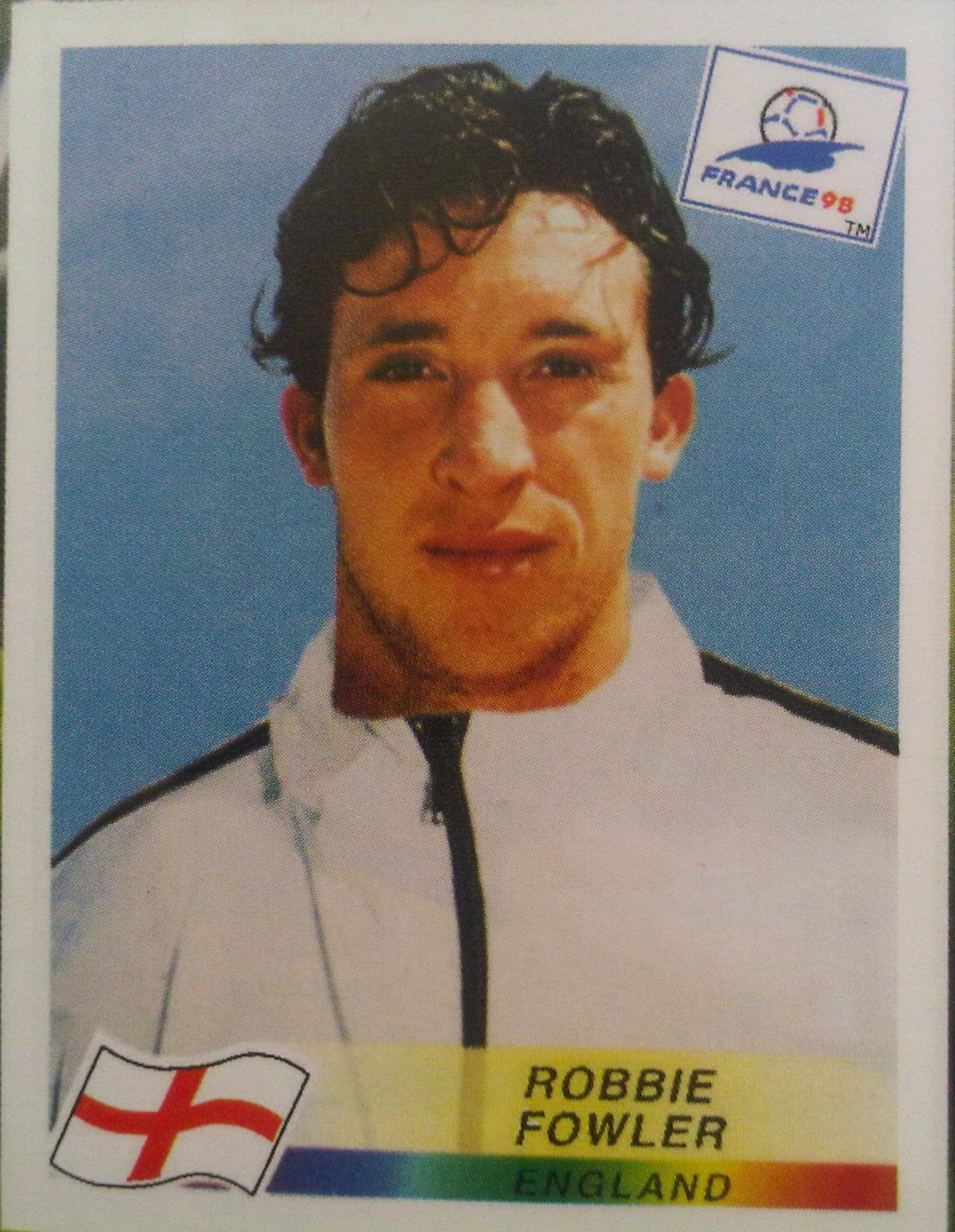
As an example, we present possibly the worst ever example...Robbie Fowler from Euro 96. Come on! At least paste the head behind the shell suit collar! Disgraceful!

Licensing Issues

We get it. In these days of image rights and tightly controlled cash cows, Panini will alas not be able to have free reign on everyone’s pictures. A common occurrence in early '90s video games, a lack of official license meant that non FIFA titles would often see the London Blues featuring Jean Frank O’Zola squaring up to the Northern Reds and their star man, Derek Canota, and we just accepted this. It even added to the feeling of rebellion if you preferred the non-officially endorsed games.

Yet for Panini this state of affairs has brought nothing but derision. Having looked back through the years, it’s clear that this used to affect a lot of international teams, but of course in the days before Google, our innocent eyes saw no wrong. Could we really be so sure that wasn't Saudi Arabia’s actual kit that season? Nowadays, it’s a lot harder to get away with, but what irks the most in recent times is that of the England team pages.

Since rival Merlin got their hands on the exclusive rights to the England team, we've been subjected to a parade of shame, with the famous Three Lions replaced by nothing more than a circle with a red cross in. Now maybe we could deal with this if it was the worst it ever got, but the horror continues.

For the Euro 2012 album, each team had not only their usual team array of player pics, but also an extra three stickers to showcase their stars ‘In Action,’ with photos of the stars from an actual match - albeit with the official Euro 2012 ball looking suspiciously photoshopped into most of them.

So what did England get? Well, not only were all the England players just a series of floating heads on a white t-shirt, the ‘action’ shots appeared to be the same floating heads, only this time floating in some kind of green cosmos! It’s almost reached the point where we’d rather England not qualify than suffer this endless humiliation!


Half-sized stickers for ‘smaller’ teams

It never meant much as a child, supporting an English club. Every year, Panini would release their much-awaited annual sticker collection - Football 78, 79, 80, and so on - and every year we would fill up our albums until we were exhausted of pocket money or enthusiasm. Yet one thing never seemed peculiar or just plain wrong to us: Why were the Scottish players always on half-sized stickers?

One answer may lie in the fact that as small children, we were somehow pleased with the fact that you appeared to be getting more for your money; two players for the price of one probably seemed very generous back in the day. Through adult eyes, the reality is all too stark, however. Where Panini were concerned, Scottish players weren't good enough to appear on a full-sized sticker of their own, so they’d have to budge up and allow a colleague to share the limelight.

This seems grossly unfair now. Granted, Scottish football didn't have top billing south of the border like English football did, but if you’re marketing your sticker collection to a British market, why not treat Scottish players with the same importance as the English ones?

Imagine the kerfuffle if Panini had applied the same sensibilities to some of the less successful English First Division clubs. Would Leicester City or Stoke City fans have been happy if their favourite players had been shrunk to half-sized representations of themselves? Probably not.

The argument could be extended to those countries making an all-too-rare appearance in one of Panini’s World Cup albums. No full-sized player stickers for South Korea or Algeria when we were kids, oh no.

Anyway, you get the idea. Equality was never one of Panini’s priorities for many years, but at least they corrected that in more recent times. Better late than never.

Elusive / Bountiful Stickers

Collecting Panini stickers is one of the most random things you can do in life. You could walk into any newsagents in the UK and ask for any packet of stickers from any box on any given day, and the stickers you’d find within your packet would have been placed there randomly by Panini on any given day too.

Yet if that’s all true, why did you always end up with eleven doubles of Southampton’s David Armstrong when you were still yet to catch your first glimpse of that Liverpool shiny badge after several weeks of collecting?

Such tales of inconsistency can be found buried deep in the psyche of a million and one former collectors and it’s no surprise that conspiracy theories have abounded for decades. Were certain stickers produced in smaller numbers to generate greater sales as kids tried desperately to get that elusive Leicester City goalie with the crap moustache?

In truth, it seems unlikely, but that does little to relieve the ongoing irritation of not finding those hard-to-find stickers… and the rapid accumulation of those you cared little for.

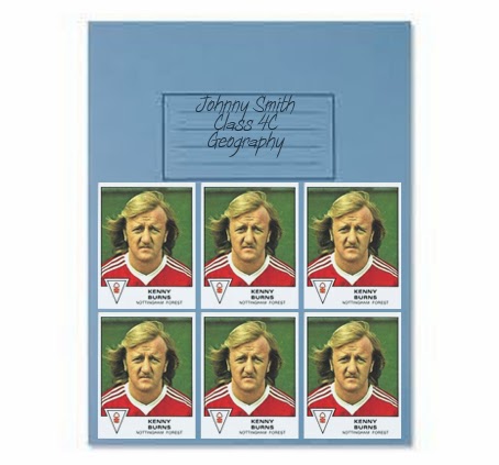
There wasn't much you could do with your swaps once you’d failed to exchange them with all your playground pals. One idea favoured by some was to use them as decoration for a school book. Let’s face it, football stickers were always going to be better than that piece of wallpaper your Mum gave you, to say nothing of that page from Razzle that your mate had nicked from his older brother’s secret magazine stash.

If done correctly, however, an exercise book covered with multiple versions of the same sticker could be as artistic as an Andy Warhol print (albeit without the rainbow colour palette).

The only downside was that you’d have to spend several terms avoiding the sight of Kenny Burns unless you had an alternative and, frankly, better looking player instead. (Sorry, Kenny…)

Nothing's ever perfect, so it seems, but what did you dislike about collecting Panini stickers? Was there something that always irritated you about the ripping, peeling and sticking that made the Panini legend what it is? If so, leave us a comment and let us know!

Billy Hamilton's Football Academy (1985)

$
0
0
Many have tried and failed to encapsulate the world of football in a board game. Whether it be the thrill of scoring goals in a big match or the mental discipline required to manage a great team, you can be sure it's been recreated at some point for the purpose of entertaining children and their families.

Among the lesser-known titles is Billy Hamilton's Football Academy, a game supposedly conceived by the erstwhile Oxford United, QPR and Northern Ireland striker. I want to believe this is true, and there's nothing to suggest it wasn't, save for a bit of tinkering by the board game manufacturers. I say this because Hamilton's express wish appears to be to detail every aspect of a player's career from being a humble apprentice through to winning the World Cup (potentially, at least).

Detail is very much the watchword in this game as can be seen on the board which is dazzling in all its colourful splendour. The playing area is circular and has concentric tracks flooded with illustrations and text that provide all the intrigue and fascination that make you want to play in the first place.

Between two and six people can take part, and the object is to travel around the board initially as a football trainee collecting Skill and Effort tokens by rolling a dice. The outer ring of the board is where the action takes place in this first part of three, and the messages found on many of the spaces show where Billy Hamilton's own experience comes into play. "You volunteer for extra training - Gain 2 Effort" and "Manager adds you to first team squad - Gain 2 Skill" give an insight into the continuing struggle to improve as a young player.

But there's also a notable mention of the more menial tasks that have to be done when you're setting out at the bottom rung of the football ladder. One space instructs you to "Sweep the terraces - grab a broom" whereas others speak of clearing snow, running a bath, cleaning boots or 'making a nice pot of tea for the pro's after training'. There's no denying Hamilton's intent to show the less glamorous side of being a footballer alongside the fame and adulation, and this adds to the charm of the game.


There's also the chance to gain or lose tokens by picking up a 50/50 card or a Linesman's Flag card. Once again, the devil's in the detail as you're told "You have put the wrong studs in the 1st Team's boots - Lose 2 Effort" or "Linesman flags as you control the ball with your hand - Lose 1 Effort". And you wondered why this game wasn't endorsed by Diego Maradona...

Three circuits of the outer section of the board have to be completed before moving onto the second part of the game, and if I'm honest, those three circuits get less interesting the longer they go on. Though the messages and the collecting of the tiny plastic tokens starts out as being quite enjoyable, it does get a little tedious towards the end. No matter, because the next bit of the game concentrates on being a fully qualified professional, but before that can be done, there's some mathematics to attend to.


To determine the position you're going to play in for the rest of your career, you first need to divide the number of blue Effort tokens you received by three, then add that number to the amount of red Skill tokens you've accumulated. If the total is 19 or below, your lot in life is to become a goalkeeper; 20 to 24 and you'll be a defender, 25 to 29 and you're a midfielder whereas 30 or more ensures your fate will sealed as a striker.

Being a striker undoubtedly gives you a strong chance of winning the game, because in Part 2, you travel around your positional track on the board taking instructions from whatever the rule book tells you. Suffice to say that the rule book has more favourable messages for the strikers than it does for the goalkeepers.

Goalies roll the dice and move around the ring of green shirts, while the defenders are on the orange ring, the midfielders are on the blue and the strikers are on the pink. When you land on a space, you use the relevant number to look up the accompanying message in the book. The optimal outcome is to collect one or more goal tokens in readiness for the final part of the game and many of the messages provide in this respect. "Save a penalty - gain 2 goals" or "Score with an overhead kick - gain 2 goals" could be the outcome, but you may just as likely be dealt a slice of life with the message "Visit a supporter in hospital" or "Interviewed on local radio" that carry no goal tokens. In this instance the game falls a little bit flat as by now you're purely focused on gaining goal tokens. Are you really bothered if you've 'entered a fun-run for charity' or 'visited a children's home'?


Any such interest in the minutiae of being a footballer starts to fall away quickly by the time you reach the final inner circle of the board, for it's here that you enter the 'International Stage'. An extra dice comes into play now as you attempt to traverse the last 18 spaces quicker than your opponents. The skill comes in 'pledging' the right number of goal tokens (those pleasing flat yellow plastic footballs) to ensure the right result on the dice. By adding your tokens to the number on the black dice, then subtracting the number on the white dice you end up with the number of spaces you move forward. If it's a minus number, you move backwards.


Any goal tokens you pledge go back to the bank, so it's vital to land on a space where you earn more tokens to keep you going. "You make your international debut - gain 2 goals" is the sort of thing you want to hear at this point, whereas "Go to tailors and measure up for a squad travelling suit" probably isn't.

Anyway, without really being fully aware, the final ring of yellow spaces is leading you to eventual glory as a World Cup Winner, but it's an anti-climactic finish that lacks all the triumphant messaging you want to see as you reach the peak of your footballing career. Not only that, but as I found in playing the game, you can easily run out of goal tokens before you even reach the end, thus highlighting an unfortunate shortcoming of the game.


When the end does come, however, you're left with conflicting feelings about the hour that's just passed. On the one hand, you have to admire the effort that's gone into the making of the game, from the delightful coloured football boots that act as playing pieces, right through to the real-world instructions on the board and the ease with which you can get started without reading copious notes that are hard to understand. Unfortunately the element of submersing yourself in the fantasy of being an actual footballer weakens as the game progresses. There's less need to chuckle at the wording as you realise it's all about gaining tokens and getting to the middle of the board first, which is a shame.

For all that, however, there's not a football board game in the world that's perfect and for that reason it has to rank among the better ones that are available. Well done, Mr Hamilton - you may not be a World Cup Winner, but you certainly gained 2 Effort where I'm concerned.

-- Chris Oakley

Chris O's Favourite 5... World Cup Shirt Number Fonts

$
0
0
Let's just put to one side the slight awkwardness of the title and instead spend a moment or two considering shirt numbers. First seen in 1924 and not used on a regular basis until around a decade later, these humble little digits have helped us to identify the players on the pitch with considerable ease. Without them, it would have been near impossible to distinguish one player from another unless, of course, they happened to be the proud owner of a regrettable Robbie Savage-style haircut.

Yet it's one thing to wear a number on the back of a shirt; doing so with boldness, flair and panache is another thing entirely. A distinctive typeface can make all the difference when setting your team apart from the rabble that it plays against week in, week out, and the best place to do so is on the global stage.

Where the World Cup is concerned, fixed squad numbering (where a player where's the same number throughout the tournament) didn't begin until 1954. The number styles seen on the backs of players' shirts was fairly rudimentary back then as you'd expect, and the emphasis was on clarity and readability rather than ostentatiousness. To that end, one or two countries were already cottoning on to the fact that the wearing of ridiculously large numbers made for sharpness and originality.

But which of the world's great football-playing nations have really nailed the art of wearing shirt numbers that are bold, distinctive and a little bit different from anything else? Here are my favourite 5, thanks for enquiring...

1. Argentina, 1978


In 1974, we all got our first sight of two classic shirt number fonts that were to dominate football for years. One of them we'll be coming to shortly; the other was a beautiful depiction of the numerical form using lines rather than solid shapes.

Shown here on the right, the 'lines' motif was seen predominantly on Adidas kits right through until Italia '90, and a few slight variations on the theme came about as a result.

One such tweaking of the original design is my first choice. Worn just once for Argentina's opening match of the 1978 World Cup against Hungary, these numbers were squarer than the arche-type (sorry), and you'll note the lines are both thicker and more spaced out too.

The result is a number font that ranks as the best one Argentina have ever worn, in my view. It's bold enough to be seen clearly on those classic sky blue and white stripes, it was modern enough to look contemporary 37 years ago and no-one else dared summon up the courage to wear them either.

In short, those numbers looked fantastic. Such a shame, then, that it was only the Argentinian goalkeeper Ubaldo Fillol that continued to wear his number 5 in that style through to the end of the 1978 World Cup. His team-mates, sadly, preferred the solid 'gridiron-style' font after the first match. Fools.

2. Various, 1974-1998


The other legendary shirt number font that made its debut in the 1974 World Cup was worn by the hosts and eventual champions West Germany, although it was seen on the shirts of many more teams for a further 24 years.

The '3D block' was a game-changer in the world of shirt number fonts. It became the most widely recognised of all number styles, and though it no longer graces the World Cup, you can still find it being worn somewhere on the planet today, such is its enduring appeal.

In the picture above, I've shown West Germany wearing their three-dimensional numbers during the 1978 World Cup, but frankly I could have chosen any number of other countries all doing the same. Whatever the colour combination and whatever the year, it always looked brilliantly current without quickly becoming outdated. A great example of when design takes a great leap forward.

3. Italy, 1978


Staying with 1978, how about this for a gorgeous twist on the common 'gridiron' font I mentioned earlier?

To this very day, teams still wear numbers that are familiar for having their corners cut off at 45 degree angles, but not many have their middles hollowed out. (That's the numbers, not the teams.) This font used exactly that approach to create another type of shirt number that no-one else wore during Argentina '78 and no-one's worn since in this exact form.

Heaven knows why not. It's crystal clear, beautifully proportioned and would work well in any era. Another overlooked classic.

4. South Korea, 1986


These days it's not uncommon to see any team in the World Cup wearing a shirt number font that you probably saw only yesterday while using Microsoft Word. And yes, it's all very nice that modern manufacturing techniques allow you to make use of that same font list when physically creating your shirt numbers, but they still require some effort if they're to look anything but 'off the shelf'.

South Korea's numbers from the 1986 World Cup prove a point. The typeface itself probably isn't a million miles away from a bold version of Times New Roman, but someone somewhere had the idea of cutting out the middle, much like Italy's numbers in 1978.

The effect is magnificent. The numbers are strong enough to be seen from far away, but the serifs and the cut-outs both give the numbers a unique look of their own.

Creativity and imagination: two words sadly lacking from many of today's football shirt numbers, but those canny South Koreans certainly knew how to craft a decent font with this lovely piece of digit-based delightfulness.

5. Netherlands, 2006


And so to my final choice which probably hasn't even remotely reached the furthest corners of your consciousness, so recently was it worn. That's probably because this 'digital' font was used by the Dutch national team not only in the 2006 World Cup but also four years later in South Africa.

Like the '3D blocks' mentioned earlier, this typeface straight out of Pong probably shouldn't work very well due to its futuristic appearance. It might look fine on a TV screen, but on the back of a shirt? Surely not...

Well actually, yes, it does - and how. Proving yet again that numbers don't have to have curves to be readable, this computer-style font never looked better than it did when in black on the back of those iconic orange shirts. There's nothing overly engineered about this font; only the merest hint of a 45-degree angle draws the eye away from the distinct verticals and horizontals. Simplicity is the key, much like the free-flowing football played by Cruyff and Co.

Having been discarded from a third consecutive World Cup last year, any hopes of seeing the Netherlands make this font a national footballing brand were dashed, and that's a shame. Those squared-off numbers could've become a legend for the future were it not for the marketing strategists at Nike who clearly felt they knew better.

Still, there we are. We live in a world where FIFA's four-yearly global championship is without fail a shop window for the kit designs of Adidas, Puma and Nike, and they tend to have one set font for all their teams, most of the time. Has the age of the creative opt-out passed us by? Let's hope not. Shirt numbers can be a work of art in their own right, if designed correctly, and no worse off for having a great deal of care and attention lavished over them.

-- Chris Oakley

Sitting Alongside - The Golden Age of Co-Commentary: Part 1

$
0
0
When idly passing by an hour or two, it's greatly satisfying to recall happy memories of long hot summers, pre-decimal coinage and the sweets you used to buy from the corner shop on your way to school. Kola Kubes, in my case. Or occasionally Mint Humbugs. Or Jelly Babies.

Anyway, where was I? Oh yes, football commentary. When feeling nostalgic, there's nothing better than remembering an era when a football commentator on TV was joined by someone who occasionally (and only when invited to do so) would give their personal thoughts on the game in progress. These 'co-commentators,' as they became known, were usually ex-players or current league managers, or both, on very rare occasions.

What they provided was insight - insight that could only be gained from someone involved in football at the very highest level; an antidote to the speculative ponderings of Brian Moore, John Motson and many more besides. Many were naturals in their new-found role but others were less self-assured or, to use common parlance, just plain piss poor.

And so it falls to The Football Attic to record the contribution made by these men, and as we do so, let's give a score to each one based on five main categories:

Insight - Being able to say something that wouldn't have naturally occurred to the viewer and could only be said by someone who knows football inside out.

Speak-when-you're-spoken-to-ability - In short, knowing when to keep schtum and respecting the commentator's top billing as main speaker throughout the game (we're looking at you, Mark Bright).

Humour - Adding comedy with a light touch whenever necessary without thinking it was a chance to perform a stand-up routine to a nationwide television audience.

Controversialness - Lacing your dialogue with just enough opinion to get the audience at home discussing the relevant issue at great length without polarising the entire audience.

Delivery - Speaking the words in your head without hesitation, repetition or deviation. Or as if English is your second language, for that matter.

And now, let us begin...

Atkinson, Ron

An unfortunate place to start for reasons already apparent, possibly, but let's do what we can. 'Big Ron' caught the attention of ITV's men in suits having assembled a West Bromwich Albion squad that regularly qualified for European competition in the late-1970's (ask your grandparents). Always at ease in front of the camera for those vital post-match interviews, he finally took the ITV shilling during the 1980 European Championships where he assisted Martin Tyler and Brian Moore.

Proving he could talk convincingly from a manager's point of view about tactics, formations and individual players, he became ITV's co-commentator of choice for many years. World Cups and domestic Cup Finals followed in abundance, but he soon found himself relying on mangled metaphors and twisted idioms (cf. "Early doors,""tourneyment," etc) to build any sense of personal idiosyncrasy. And that's to say nothing of the plethora of foreign player names he mispronounced.

Not that it seemed to harm his career as Atkinson went on and on into the 1990's and 2000's, taking in Champions League matches and any other high-profile event that he was called upon to oversee. Then came the crashing end to it all when he was heard making awful racist comments about Marcel Desailly after a broadcast of the Chelsea v Monaco match in 2004. Atkinson's microphone was still on when the UK broadcast had ended, and the live feed was still being heard in other parts of the world - not that Atkinson was aware at the time.

The sack soon followed and his long career ended abruptly - justifiably so. True, Atkinson was good in his day, but in light of his final, enormous gaff it's anyone's guess why he wasn't caught out sooner.

Insight - 8.5/10 Speak-when-you're-spoken-to-ability - 8/10 Humour - 5/10 Controversialness - 6/10 (before his career ended) Delivery - 7.5/10. OVERALL - 7/10.


Brooking, (Sir) Trevor

No sooner had Trev hung up his boots for the last time at West Ham than he was being dragged forcibly by the shirt collar to his first BBC commentary gig. Mild-mannered and the sort of 'nice young man' your Nan would have approved of, Brooking fitted the BBC profile of polite respectability perfectly. Ironic, given the calibre of people they were employing in other areas of the organisation *coughYewtree*.

Brooking made an early appearance in front of the TV cameras at the start of the 1970's as a studio guest on ITV's 'The Big Match', but it was behind the mike that his post-playing career came to pass at the Beeb.

Though the Upton Park idol offered much in the way of wholesome decency to his co-commentary role, he regrettably became known for not being able to form a strong opinion for or against any particular argument. Were it not for the fact that Humpty Dumpty got in first, Brooking would have led the way in sitting not only on fences but also walls or other free-standing structures wherever appropriate.

That aside, he became BBC's 'Mr Reliable,' putting in many hours of service during the World Cups of 1986 and 1990, appearing also in sound only for every FA Cup Final between 1989 and 1997. England internationals and domestic spectacles also appeared on Brooking's CV and by the time he stepped down from his duties, there was barely any football event he hadn't co-commentated on.

If only he'd said something controversial once in a while...

Insight - 6/10 Speak-when-you're-spoken-to-ability - 9/10 Humour - 5.5/10 Controversialness - 4/10 Delivery - 9/10. OVERALL - 6.7/10.


Charlton, Sir Bobby

Much like Brooking, Sir Bobby had every box ticked when the BBC were looking for someone to take on the role of football co-commentator, but with one additional 'wow' factor - he'd won the World Cup with England.

Who better, then, to cast his eye over football's rich tapestry of theatre and zeal than one of the great gentlemen of the English game? Although his temperament really was gentle, he was also constructive with his comments and tremendously encouraging to players and teams that had played well.

His first major outing with the BBC came at the 1978 World Cup where he joined David Coleman and Barry Davies in the commentary box, coincidentally during the same tournament where his brother Jack was performing the same task for ITV. They'd repeat the same cross-channel double act during the 1982 World Cup, too...

Before long, Sir Bobby was drafted in to cover the 1980 and 1984 European Championships, the World Cups of 1986 and 1990, plus a host of other key matches. His quiet, easy-going style coupled with a series of well-honed, relevant observations made him the ideal choice for the BBC, bringing dignity and respect to a role that can be divisive in the wrong hands.

When the 1990's arrived, we saw less and less of the Man United hero (blame Trevor Brooking for getting in first when the talent was being booked), but by then he'd earned a well-deserved rest. A career in co-commentating almost as exemplary as the one he'd had when playing, Sir Bobby Charlton knew how to talk about the game, and when to do so. Take note, all ye who follow in his footsteps.

Insight - 7/10 Speak-when-you're-spoken-to-ability - 10/10 Humour - 4/10 Controversialness - 5/10 Delivery - 9/10. OVERALL - 7.0/10.

And before Part 1 comes to an end, a quick mention for some other co-commentators who tried their hand at coherent football-related speech while a huge viewing public listened intently...

Bond, John: More of a studio panellist, he sat alongside Brian Moore for the crucial England v Hungary qualifier for World Cup 82 at Wembley. Slightly grumpy in vocal tone, no-one could deny his knowledge of the game or fail to appreciate the apposite comments he made.

Brady, Liam: Former Arsenal midfielder and a classy one at that, most of his punditry work was done for Irish broadcaster RTE in latter years, but his co-commentary skills came to light when Ireland reached the 1990 and 1994 World Cup. Knowledgable and not afraid to give his views when asked to do so.

Channon, Mick: Another ITV pannelist par-excellence, and one who dared to lock horns with Brian Clough in the process. Behind the mike, he was just as plain-spoken and amusing, and refreshingly so. Sadly he didn't co-commentate all that often, nor did he do that windmill thing with his arms when he spoke, but you can't have everything.

Coming up in Part 2:
A famous footballing brother, an old big head and an even bigger chin... who could this possibly be a reference to...?

-- Chris Oakley

Football Crazy (1977)

$
0
0
The school tuck shop. A place where for decades juveniles have queued up, exchanged money for substandard food and consumed the very things they acquired, purely for pleasure alone. 'Nutritional gratification' was nowhere to be seen, apart from those freaky kids that bought an apple at break time. Who the hell buys apples, for heaven's sake?

No, for the schoolchildren of the 1970s and 1980's in particular, it was common - nay, expected - that your daily food consumption consisted only of items that in no way benefited your personal health and well-being. Crisps were a great example of the genre. Though in essence derived from the perfectly decent potato, the addition of preservatives, colourings and copious amounts of hot oil transformed it into something that passed through your digestive system to no great effect. But my, did they taste fantastic. Artificially fantastic, but fantastic all the same.

Among the many varieties available was Football Crazy, a favourite among tuck shop regulars of the late 1970's. For four-and-a-half new pennies, you could have yourself a small packet of corn and potato snacks shaped like footballs (vaguely) and flavoured like smokey bacon. They were cheap, tasty and guaranteed to clog up your whole mouth with the sort of substance which, these days, you're more likely to find pumped into wall cavities as insulation material.

For the average football-loving child, however, there was more indulgence to be had thanks to the canny marketing of Smiths' Crisps. Their idea was to create the Football Crazy Club, which kids could be a member of if they sent off enough the required number of empty crisp packets. Once a member, they'd receive all many of goodies through the post such as the obligatory newsletter, stickers and anything else they could churn out for little or no expense.

Even if you weren't a member of the club, you could still send away your wrappers to pick up special items, like the 'Laws of Football' booklet advertised here. It was as if Smiths Crisps were saying "We know you like football, so allow us to give you lots of nice things in return for buying our corn/potato snacks."

How very convivial, and how very 'Seventies'. It just wouldn't happen now, though. Kids, I'm convinced, aren't interested in stickers or posters or 'Rules of the Game' booklets. Crisps must still be popular with kids though, aren't they? If so, could you persuade them to send off 15,700 empty packets in exchange for a copy of FIFA 15? Nah, thought not.

-- Chris Oakley

'F.A. Rules OK' image by kind courtesy of Football Cartophilic Info Exchange.

Goal Frames We Have Known and Loved: No.3

$
0
0
Empire Stadium, Gżira, Malta:


Look closely at the grainy black-and-white image above and you'll see something rather spectacular. It's a set of goalposts made entirely out of pelican crossing lights.

Actually that's not true. They couldn't get the bulb to flash on the top.

No, these are in fact proper black and white striped goal posts as seen for many years at the Empire Stadium just north-west of Valetta, Malta. The above picture is taken from the Malta v England match that took place in 1971, and as you can see, they're every bit as bizarre as they are eye-catching.


Not only are the posts an absolute delight to behold (Newcastle United fans, contain yourselves) but the back frame of the goal was also peculiar because of its three support posts. That's THREE - one at the back left of the net, one at the back right and one in the MIDDLE.


Quite why it was deemed necessary to add a third post down the middle is anyone's guess, but it's just the sort of idiosyncratic idea that added so much fun to the world of football years ago.

As if the goalframes weren't crazy enough, the pitch at the Empire Stadium in Malta was made up predominantly of white sand. Any team that played there (and many did, from England to Ipswich Town to Real Madrid) could tell you how tricky that was to play on - in fact Sir Alf's band of happy wanderers only just scrambled a 1-0 win there back in February 1971.

Then again, it's easy to be distracted by innovation and originality when it's so unavoidably in your midst. We can only imagine every visiting player must have spent hours gawping at the monochrome genius of those goal frames, so if possession of the ball was easily lost, so be it. We'd have no doubt done the same.

Ladies and gentlemen, we give you the goal posts of Gżira: true black and white brilliance.

Structure: 9.5
Net pattern: 7
Net colour: 7
Overall: 8.5

-- Chris Oakley

See also:

Viewing all 451 articles
Browse latest View live


<script src="https://jsc.adskeeper.com/r/s/rssing.com.1596347.js" async> </script>