Quantcast
Channel: The Football Attic
Viewing all 451 articles
Browse latest View live

Chris O's Favourite 5... FA Cup Finals

$
0
0
As it's FA Cup Third Round day, I thought I'd take a slow walk down memory lane to remind myself of my favourite five Finals from years gone by.

1. West Ham v Liverpool (2006)
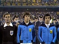
“Surely the best Cup Final of modern times” according to BBC commentator John Motson and even now, some six-and-a-half years later, it’s difficult to disagree with him.

For any fan of a losing finalist in any competition, it’s some consolation at least when your team gives a good account of itself, and for me, West Ham certainly did that in 2006. Going 2-0 up through a Jamie Carragher own goal and a Dean Ashton toe-poke from close range, West Ham took the game to Liverpool but they hadn’t accounted for a one-man colossus in red called Steven Gerrard.

The Merseyside club clawed their way back to 2-2 thanks to a Djibril Cissé volley and a Gerrard thunderbolt, but even after Paul Konchesky’s speculative cross had put West Ham back in front at 3-2, Liverpool still weren’t prepared to accept defeat. A second incredible strike by the England captain ensured the game was tied at 3-3 going into injury time, and with the resulting penalty shoot-out swinging in favour of The Reds, this was not to be West Ham’s day.

And what of my feelings after the game?  Not disappointed really, no. Pride – that was my predominant emotion. Pride that my favourite club had played its part in a memorable Final and earned the respect of many neutrals watching from afar. You can’t ask for much more than that, can you?

>

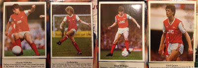
2. Arsenal v Manchester United (1979)

When dewy-eyed nostalgists think of the perfect FA Cup Final, they probably think of one where both teams play football of the highest order for 90 minutes before a thrilling climax ensues. In many ways, the 1979 Final was exactly that.

Much like the West Ham/Liverpool clash of 2006, one of the teams – Arsenal – went 2-0 up and were leading comfortably by half time. Brian Talbot, who played for Ipswich against Arsenal the previous year, scored the first goal after 12 minutes and Frank Stapleton added a header just before the interval.

That two-goal cushion remained in place until four minutes from the end when United staged a late comeback. First, Scottish international defender Gordon McQueen swivelled and put the ball past Pat Jennings from close range, then, Sammy McIllroy industriously battled his way through the Arsenal defence to make it 2-2 in the 88th minute.

Everyone, myself included, couldn’t believe how Arsenal’s dominance could crumble in the space of two minutes. According to Brian Clough, ITV’s co-commentator on the day, United had earned their stay of execution having battled all afternoon, but surely Arsenal shouldn’t have given them the opportunity in the first place? Had they lost the plot?

Remarkably, the answer came only a minute later when, soon after kick-off, Graham Rix crossed to find Alan Sunderland in the penalty area. His outstretched leg reached the ball before Arthur Albiston could get to it and in so doing poked the ball over the line. With just a minute left on the clock, Arsenal had taken the lead once more and were able to hang on until the final whistle blew just moments later.

Very few Cup Finals had ever set such a high standard for excitement but this one became the benchmark for all future Finals to reach. I can still remember that last goal going in as if it were yesterday, but to be honest the rest of the game doesn’t come quite so readily to mind. Maybe it doesn’t have to when you have an ending to beat all endings.


3. Liverpool v Newcastle United (1974)

In 1974, Malcolm MacDonald seemed to be single-handedly transforming the fortunes of Newcastle United. Having won the Inter-Cities Fairs Cup in 1969, the Tyneside club had failed to build on their new-found success but the acquisition of MacDonald from Luton Town had gone some way to correct that.

A prolific striker in his day, he was at the top of his game come the 1974 FA Cup Final – so much so that, according to Emlyn Hughes, he’d been telling the press that The Magpies were going to turn over Liverpool at Wembley and that they had a far superior team.

When the big day arrived, Liverpool had other ideas – and a top strike duo that were more than a match for Newcastle. Kevin Keegan and John Toshack were fast developing a reputation as a lethal partnership that provided many goals for the Anfield club, and in the ’74 Final they and the rest of the Liverpool team were ruthlessly dominant.

Shots rained in on the Newcastle goal all day and quite honestly they were different class. Newcastle tried in vain to compete but Liverpool, having burst the black and white dam through Keegan’s first of two goals in the 57th minute, didn’t settle until they’d got what they came for. A second from Heighway a quarter of an hour before the end and another from Keegan two minutes from time eventually secured the 3-0 win that had been on the cards throughout.

“Goals pay the rent and Keegan does his share” said David Coleman during his BBC commentary, and if that was the case, Malcolm MacDonald and his Newcastle team-mates must have been in arrears for months.


4. Liverpool v Everton (1986)

It’s not often you get an FA Cup Final played between the two teams finishing first and second in England’s top flight, but in 1986 that very thing happened and we got a great final as a result.

The sight of Kenny Dalglish leading the team out as manager yet ready to play alongside his team-mates must have been a stirring sight for Reds fans everywhere, but Everton had talent throughout their ranks too. Andy Gray had been replaced by Gary Lineker, Kevin Sheedy and Trevor Steven provided flair and reliability while at the back Kevin Ratcliffe and Derek Mountfield provided a rock-solid base in defence. At the back, however, Bobby Mimms was deputising for the absent Neville Southall. Would that be the weak point in this all-too-rare Merseyside Cup Final?

The start of the match suggested otherwise as Lineker grabbed the opening goal after his early shot was spilled by Bruce Grobelaar. Everton still led 1-0 at the start of the second half and looked to have the bit between their teeth until Ian Rush rounded Mimms to equalise in the 56th minute. After that, Liverpool smelled blood and Craig Johnston was on hand to finish off a great move six minutes later to make it 2-1.

As Everton tried to get back into the game, the inevitable gaps opened up in defence and Liverpool finally took advantage when Ian Rush scored a second, just seven minutes before the end. When the final whistle blew, Bob Paisley’s side had won the double – the first time any team had achieved it since Arsenal in 1971 – and a truly great side from the red half of Merseyside rightly basked in the glory.

Despite being a Londoner who had seen so many local sides grace FA Cup Finals throughout the 1970’s and early 1980’s, this was still an enjoyable spectacle for me and one which lingered long in the memory thereafter. Everton, however, were still to have their day –they’d win the First Division title the following season.


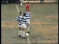
5. West Ham v Arsenal (1980)

And so back to West Ham, I’m afraid. A final indulgence from me, but unashamedly so, not least because it was the last time I saw my own team actually win the FA Cup.

I remember the day of the Final with some clarity, despite my ever-faltering memory. Early on, my sister had been making rosettes from claret and blue ribbons – something that people probably rarely do these days. Yet it was all part of the build-up to the event for us local Hammers fans, keen as we were to wear the club’s colours with pride.

The weather was glorious. Warm, bright sunshine illuminated Wembley as Terry Neill and John Lyall led their teams out in front of a capacity crowd. West Ham were the Second Division underdogs and Arsenal were the First Division favourites. This was The Gunners’ third consecutive FA Cup Final but would ultimately be their second defeat in that run.

To their credit, West Ham never looked overawed by their opponents throughout. Under the cosh they may have been at times, but they didn’t look unduly flustered or nervy, and this was helped in no uncertain terms by Trevor Brooking’s goal after 13 minutes. ITV’s Brian Moore thought the goal had been scored by Stuart Pearson – in fact we all did, I seem to remember – but the confusion caused by the way the fast-moving ball in a congested Arsenal penalty area was eventually resolved and the tone was set for an ultimately joyous afternoon.

Of course we can’t let this review of the 1980 Final go by without mentioning the deliberate foul on Paul Allen by Willie Young when the former was clean through on goal late in the game, but it’s all water under the bridge now and not worth dwelling on. Instead, here’s a less than flattering picture of Willie during his Aberdeen days. Now let that be a lesson to anyone thinking of doing the same.


The Football Attic Annual

$
0
0
Cover
It started as a Christmas present for Chris and myself, but after posting pics of it on Twitter, we received quite a bit of interest from people wanting to know if we planned to sell them.  I hadn't, but if people wanted them, why not share the Attic love?

Chris and I have gone through all of 2012's articles (and a few from 2011) and picked out 22 of our  favourites, covering 30 pages, all wrapped up in a rather lovely hardback book...proper Annual style!

If you'd like one of these, they'll be £16.50 delivered in the UK (outside the UK, contact us and we'll let you know how much it'd be). These are being done pretty much (talking pence here) at cost so we very much hope you'll enjoy them :)

Inside...


Contact us on Twitter (@footballattic) or at admin[at]thefootballattic[dot]com.

I've ordered 13 in total and once they're allotted, they'll be gone! 

Cheers,
Rich & Chris

Update: I've had a "yes" from the following people so that's 10 gone and 3 left.

Anyone I've missed, please shout!

David Hartrick
Jay Richardson ‏@TivertonHornet
rob stokes ‏@JossiesDad
Peter Miles ‏@PeterRMiles
Kris Horton ‏@roman_machine
Al Gordon ‏@algordon_cafc
GFO_Editor ‏@Gillsfansonline
Sky Blues Blog
David - Football Gaffes Galore
Alex Gunn


The League of Blogs 2013 - Vote Now!

$
0
0
You may have noticed a new page on the blog in the list above...

The League of Blogs will shortly be returning to the Attic, but we're shaking it up...and we want your opinion!

More details (and the chance to cast your vote) here


Kick-Off (1981)

$
0
0
It's our absolute delight to welcome back Al Gordon from God, Charlton and Punk Rock who provides us with another excellent guest post - this time on the simple pleasure of playing a classic football board game...

I’ve come to the conclusion that there are two types of people on a Sunday morning. Those who like their bed, and those who would rather endure the wind and the rain to rummage through boxes of other people’s cast-offs at a boot sale.

I’m firmly planted in the former category whilst my wife will gladly come home clutching an armful of early bird ‘bargains’ which miraculously we have previously survived without.

In the run up to Christmas, however, some of these purchases may be for me, and possibly then football related. I wasn’t to be disappointed. Amongst some wonderful Subbuteo articles, she found me a football card game from MB Games called Kick-Off.

This game has had several incarnations, originally called ‘Penalty’ and then much later known as ‘Gazza!’, but the version I unwrapped Christmas morning was not only identical to the one I owned back in 1981, but in equally good condition too!

The board is a football pitch with a grid covering it, although obviously set up for Olympic football as the flags bordering the playing surface include the Union Jack. The small football counter moves from square to square depending on which card you play. And herein lies the skill.

Each player is dealt eight cards and once you play one, you pick another up from the pack to replace it. When the pack runs out, its half time so you give them a shuffle and start again for the second period.

The cards themselves are delightful. The artist has painted two teams, the Blues and the Yellows. The Yellows even have three green Adidas stripes running down their sleeves. These aren’t faceless footballers though. The likes of Keegan, Shilton, Dalglish, Coppell and Archibald are all here and I’m left in very little doubt as to how King Kenny would have looked had he ever pulled on a Norwich shirt!

As wonderful as the detail is, we are looking at a football game here, so the main topic of discussion has to be scoring more goals than your adversary.

It isn’t just enough to play a card that will see the ball move into the opposition goal, for they may be holding either a Goalkeeper or Corner card. This is where the symbols in the cards' top corners come into play.

If your opponent scores and you are fortunate enough to hold a ‘keeper card, simply play the ball back out according to the cards instructions, not forgetting to gloat as the smile rapidly disappears from your foe's 'boat race'. Failing that and you have a corner card, the ball is placed by the corresponding colour flag. The attacking player must then cut the blind pack; if the colour matches, he’s scored. If it doesn’t... you get the idea.


It’s the same scenario with the Penalty card. There’s just the one of these but that does pretty much guarantee a spot kick in each half. All that’s required is to get the ball into the opposing penalty area and then play your 'joker’. After the initial sinking feeling has passed, the defending player must cut the cards; a hand symbol in the top corner and it’s saved. If there isn’t... yes you’re ahead of me here.

It may not have been the most animated of childhood football games but I thoroughly enjoyed it. Once the Subbuteo was packed away for the day, this was an easy chance to challenge one of the family as I looked to distract their attentions from bedtime.

Unfortunately Grandad wasn’t able to experience its pleasures first hand and just had to make do watching from afar. MB Games, for reasons known only to themselves, had a policy setting the age recommendation from 7-70 years. I can only surmise they believed their game was that exciting it could be fatal to those with a dodgy ticker.

My wife went to the boot sale and believed she had found me a cheap and humourous stocking filler. Not for one second did she realise she’d struck gold.

Either that or Santa knew I’d been a very very good lad.

Our thanks once again go to Al Gordon, and if you want to read some more of his fine writing on the Attic, check out'Al Gordon's Top 5 Patrick Kits' and'Al Gordon's Five Subbuteo Items They Never Made.'

Failing that, Chris O recently gave us his take on 'Kick-Off' in his second Videoblog - catch it here.

Football kits 'The Talbot Way'

$
0
0
The Coventry 'Talbot' kit
If you listened in to our recent podcast on retro football kit design, you'd have heard Rich and myself yakking on about the famous Coventry City 'Talbot' kit (see pic right). For those that still aren't aware, this was a special kit brought in between 1981 and 1983 to capture the spirit of Coventry City's new-found partnership with the Talbot motor group. At one time the club were even planning to rename themselves Coventry Talbot, but that's another story.

Sadly for Coventry, not even their fancy new kit got to see the light of day as often as they'd have liked. On those rare occasions when the BBC or ITV outside broadcast trucks rolled into Highfield Road, the cameras were never allowed to cast their gaze upon the big 'T', the Football League banning such obvious sponsorship from appearing on our screens.

But what if such bold, blatant sponsorship on football shirts been encouraged back then rather than frowned upon? What would football kits have looked like in the seasons that followed?

This is a question we asked ourselves during Episode 3 of The Football Attic Podcast and I'm pleased to say we're now able to provide some visual answers (of sorts).

To begin, however, one needs to understand why the Coventry 'Talbot' kit looked so good. In a nutshell, the 'T' from Talbot's circular logo fitted the shape of a football kit brilliantly. That very fact explains, perhaps, why the 'all-over' logo approach never caught on - because few company logos are tall or T-shaped. On the plus side, however, car brands like Talbot tend to have the sort of dynamic logos that can look good on a football shirt (or shorts).

Click for larger version
So how about this for a selection of car-related kits? (see left)

Here I've used a standard kit template to show Ipswich Town with Volkswagen sponsorship (2), Arsenal with Renault (3), Tottenham with Mercedes (4) and Liverpool with Citroen (5).

On the basis of my previous point about tall or T-shaped logos, Arsenal's kit should be the best of this bunch as Renault's diamond is the only one of the four that fits this category. Sadly, the complex, somewhat fussy nature of the French company's logo of the time doesn't lend itself too well to the shirt and shorts, in my view.

Of the others, Volkswagen's roundel looks clean and unambiguous, but looks a bit like someone's stuck an Art Deco plate down the front of Terry Butcher's pants. As for the Mercedes three-pointed star, I felt it best to remove the outer circle, but sadly even this doesn't improve a somewhat awkward fit.

Instead, it's Citroen's double chevron which steals the show, probably because it looks like the kind of stylish device one would see on a kit in the modern era (albeit a rather large version of one). Hardly any modification was needed on this design, except for a slight drop-shadow to accentuate the upturned V's. Pretty good, but compared to the Talbot kit, maybe still lacking in overall impact?

Click for larger version
Having exhausted all inspiration on car company logos, I thought I'd turn my attention to petrol companies next. Two logos had potential in my view - BP and Esso.

As you can see from the graphic on the right, there was only ever going to be one team that could wear the yellow and green shield with real gutso, and that was Norwich City (6). I think you'll agree it looks pretty good, even if it does turn The Canaries' shirt almost completely green.

Less successful was my attempt to put Esso's oval symbol on Everton's blue shirt (7). I thought the light blue of the oval and the darker blue of the background might work nicely as a subtle contrast, but for some reason it just didn't. As for the red text, that didn't stand out much either.

Click for larger version
All that was left was to try one more throw of the dice, and this time it came in the form of a logo that was square originally but made horizontal in order to create more of a visual stimulus. I chose the Kodak 'K' device and stretched both ends so it became a broad red band on Watford's home shirt.

The effect isn't entirely bad, and even vaguely reminiscent of the home shirt Watford wore between 1985 and 1988. The trouble is, it doesn't fill the entire strip like Talbot's big T did way back at the start of the 1980s.

And therein lies the problem. Maybe all this time we've been thinking it was a prudish attitude towards commercialisation that stopped more Talbot kits materialising, when actually it was the inappropriateness of the logos available.

It only leaves me with an increased sense of admiration for that smart designer who took one look at the Talbot logo and sensed in an instant that it could dominate the team strip in a unique and memorable way. Had it been the Renault logo, however, we might never have seen the design classic we know today.

Great Tracksuits of Our Time: No.7

$
0
0
Coventry City (circa 1978):


Seen here modelled by Gerry Daly, this is a smart design in light and dark blue with quite possibly the biggest flappy collar that's ever been seen by the human eye. Forget the Great Wall of China - this collar really can be seen from outer space.

This tracksuit top would have been worn around the same time as the famous Admiral 'tramlines' kit, and as you can see, this is a modification of that same design. Replacing the stripey lines are two broad bands curving in from the shoulder flanking a central vertical band that straddles the zip. Combine it with *that* collar and you have yet another lovely bit of kit from the geniuses at Admiral.

Seen any good tracksuits from football's rich and illustrious past? Tell us all about them by dropping us a line to admin [at] thefootballattic [dot] com. We could feature your words on our website!

Other Great Tracksuits of Our Time:

Stick With Soccer - Daily Mirror Sticker Album 1986-87

$
0
0
Say "football stickers" to anyone and they'll probably wonder why you're shouting random phrases at them in the street... and why you appear to have no pants on, but are still wearing a nice pair of shiny brogues.

That's not what this article is about though so instead I'll concentrate on the responses of those who are into football stickers, and that initial response is almost certainly "PANINI."

There are times however, when a boy decides that he wants something more than what everyone else has, when he decides to forge a path not trodden by others... and primarily when he sees a set of stickers that are bigger than Panini ones and  feature 'action shots,' rather than boring head shots.

Despite owning two of these sticker albums (86/87 and 1988), I cannot for the life of me remember how I used to obtain the stickers, or indeed the album itself. We never bought the Daily Mirror newspaper so it's unlikely I got it free via that route and the album does have a price of a whopping 25p on the front, so I can only assume I purchased it. Same goes for the stickers. Were they given away in the paper and we just bought it for that reason for a while, or were they available in packets? I honestly cannot recall, so would love someone to fill in this missing info.

So, to the album itself.

There's a brief intro from Bryan Robson, which, if you read it in his traditional monotone way, almost puts you off right there and then. I can hear the quoted words, "Stick With Soccer" (for that is the official title) being forced from his mouth with all the panache of a comatose twig.

Turn the page and we're straight into the action... literally. As mentioned, the stickers in this album are all action shots, no doubt taken from the extensive Daily Mirror archive and it's this aspect which really did appeal to the 12-year-old me. Panini may have been the official collection, but a bunch of staged headshots has nothing on proper pictures of the named stars from an actual match.

John Lukic foreshadowing Arsenal's fortunes?
No...
There seems to be one problem with this approach however, and that appears with the very first sticker in the album. The quandary facing the photo selectors was thus: What do you do when the only image of Arsenal keeper John Lukic is quite clearly landscape? Possible answers to this were "crop the image" or maybe even "Photoshop his head onto someone else's"... known as 'the Panini approach.' But no, the answer the DM came up with was "ah just put the sticker in sideways."

Yup, the first sticker in the album has John Lukic pointing at the floor. Good start, Stick With Soccer.
Sadly, Arsenal have stayed in the top flight all this time, thus robbing me of the opportunity to make some kind of 'pointing the way' / relegation joke. Cheers, Daily Mail!

*** See UPDATE below for further news on this ***

The action shot approach does have its flaws, however, one of those being the availability of images. The John Lukic debacle is one aspect of this... the other is the variety of kits you see on show. On one page, across only seven stickers, we get four different Arsenal shirts!

So...which is this season's kit then?

Dull...no that's not what it says in the Club Info!
One page that does have all that season's kits on show is Coventry City (like I need an excuse to show CCFC!)  This page, though, does demonstrate another issue with the Mirror album. Their approach seems to have been quantity over quality as, though the stickers are about 50% bigger than the average Panini ones, the quality of the shots does vary wildly throughout the book, with most pictures being rather dull in colour and often quite dark. This is not just 26 years taking their toll; I remember them being like this at the time.

Looking at the Coventry page, the contrast between the background image and the stickers makes the dullness even more apparent.  Most of the stickers look washed out and too cold. The only one that appears normal is Kilcline and the fact that one of the stickers on the page is noticeably different just highlights the lack of consistency.

A further issue caused by the large size of the stickers is there are only 13 players on each double-page spread. No fringe squad players will be found here!

Bobby Who? £25 Spending Money!!!
The format of the album is very straight laced with pages only for the 22 teams in Division 1. The only gimmick present is on the last two pages, where a Soccer Super Subs Competition appears. The idea behind this was you used your swaps to create an all star 11, which you would then stick in the blank spaces provided on the reverse of the page. The prize was a not inconsiderable one - a 7-day course at Bobby Charlton's Soccer School, including accommodation, and not forgetting "2nd class rail travel and £25 spending money."

One final note: out of the 22 clubs that made up the 1st Division in 1986/87, nine are no longer in the top flight. They now reside in the following divisions:

Yes Son, Luton used to be in the top flight...wait, come back!
Charlton Athletic - Championship
Coventry City - League 1
Leicester City - Championship
Luton Town - Conference
Nottm Forest - Championship
Oxford Utd - League 2
Sheff Wed - Championship
Watford - Championship
Wimbledon - League 2

On top of that, several clubs are back in the Premiership, having dipped out to varying degrees, Man City being the most notable fall and rise and Norwich, QPR, Southampton and West Ham having only recently returned following often intermittent stays of varying length.

While the quality may not have been up to Panini standard, it was a very worthwhile album to collect and the novelty of having action shots certainly made it worth owning, especially if one album wasn't enough to sate your desire for collecting football stickers!

The Daily Mirror followed the album with a much more professional affair the following year (and also ditched the 'season' style numbering and following Panini's style of being named after the year of release, so the one that came after would be known as Soccer 88, rather than Soccer 1986/87.) I'll review that album another time however, where you'll get to see the Mirror's attempt at foil stickers!


*** UPDATE ***

In the few hours since I posted this, Steve Jinman (@EducatedLeftFt) retrieved his Daily Mirror album and it seems his John Lukic was the right way up?!?!  The mystery deepens... where did the perpendicular Lukic come from? It's definitely a DM sticker so whaaaaa? Anyone have the answer? Was it from a previous album? An alternative universe? WHO KNOWS???

Big thanks to Steve for finding this!

The News of the World Football Annual 1983/84

$
0
0
The arrival of the 1983/84 season prompted many to wonder how far football had fallen in recent times. The game had lost its allure and was in something of a tailspin but The News of the World Football Annual, through its anecdotal ponderings, acknowledged this for the ages and tried to offer some cause for hope at the start of a landmark campaign.

The season began with a new name for an old competition. The Football League was now known as the Canon League. According to the Annual, an announcement was made on May 5 1983 that a deal had been struck with the Japanese camera and business equipment maker to the tune of £3.2 million, lasting three years.


If that figure seems paltry compared to today’s big money deals, consider this. When shared out, Canon’s money ensured every First Division club would benefit by just £10,000 each. Considering Watford’s Luther Blissett had moved from Watford to AC Milan for £1 million during the summer of ’83, it really didn't seem like much at all. True, more money was distributed for the high achievers in the League, but even then the First Division champions would only get an additional £50,000. Even the winners of the Milk Cup could expect £64,000.

Fortunately, clubs could finally rely on a greater source of income from the new TV deal that had been thrashed out between the Football League (sorry – Canon League) and the two main broadcasters, BBC and ITV. Under the terms of the new agreement, ten live games would now be shown every season. Match of the Day would show five on Friday nights, while the other five would appear on The Big Match on Sunday afternoons. No club would appear in a live match more than once, although the usual weekend highlights would continue in their regular form on both channels.

According to the News of the World Football Annual 1983/84, the new TV deal wasn’t the fait accompli it may have at first seemed. The League were reluctant to allow live games to be shown for fear that it would discourage people from attending matches in person, while the broadcasters were hesitant about showing team shirts with sponsors logos on them. In the end a compromise was reached ensuring this would be the first season where shirt advertising was seen on our screens.

Elsewhere, further changes were being made to the game. For the first time in 1983/84, the Milk Cup Final would be played on a Sunday, and to ensure the pitch was in good condition (and provide an all-round facelift), a new 20-year £4 million contract had been signed by the FA and Wembley Stadium Ltd in May 1983.

Yet such talk of contracts and high finance masked the growing malaise creeping into the international game. In England, attendances for domestic games had plummeted by 1.24 million in the past year reaching their lowest total since the Second World War. Even across Europe, only eight countries had seen an increase in the number of fans passing through the turnstiles (Scotland being one, curiously).

International matches were suffering too. Within the pages of the Annual it’s noted that the British Championship match between England and Wales at Wembley in February 1983 saw the lowest attendance ever for an England match – just 24,000 paying to see a starting XI featuring such talent as Alan Devonshire, Derek Statham and Gary Mabbutt.


As for success on the pitch, things were little better as English clubs were finding their run of dominance in Europe seemingly at an end. The previous season had seen holders Aston Villa knocked out in the quarter finals of the European Cup by Juventus along with English champions Liverpool, beaten on aggregate by Polish side Widzew Lodz.

In the other competitions, the misery continued. In the Cup-Winners’ Cup, Tottenham had been eliminated by Bayern Munich in the Second Round while Arsenal, Ipswich, Manchester United and Southampton all fell at the first hurdle in the UEFA Cup. Perhaps the English clubs could turn to Scotland for inspiration what with Aberdeen winning the European Cup Winners Cup and Dundee United unexpectedly reaching the UEFA Cup quarter finals.

The times were certainly ‘a-changing according to the News of the World Football Annual 1983/84, not least because Liverpool, the biggest club in the country, were about to begin a new era under the managerial leadership of Joe Fagan. The 1982/83 campaign had ended with Bob Paisley retiring from the game after a nine-season run in which The Reds had picked up 20 major trophies. They were now faced with the task of trying to maintain their unprecedented success by once again promoting from within the Anfield boot room. No-one could be sure Fagan would be able to do so, but a look back at Paisley’s roll of honour would provide his team with ample inspiration for the coming season.

If Liverpool had one quality above all others it was the ability to score goals, yet amid a period of uncertainty and negativity, it was pleasing at least to be reminded of one final statistic from the 384-page pocket annual. The 1982/83 season had provided the highest number of goals across all four English divisions for 15 years, and which team stumped up with the most goals of all the 92 teams? Why Wimbledon, of course. The Division Four champions scored 96 in total - nine more than Liverpool.

Nintendo World Cup, 1990

$
0
0
We're delighted to say that Matthew Wassell is back in the Attic, and this time he's reliving a football computer game in glorious technicolour...

With it being yet another snowy afternoon in deepest Norfolk, my thoughts turn to the joys and heat of summer and in particular, the World Cup. Released in 1990 for the NES and Game Boy, Nintendo World Cup aimed to bring the excitement and glamour of the world’s most popular football tournament to the monochrome, handheld screen and having received it as a present from my grandmother 22 years and five World Cups ago, I've decided to try it out once more but this time on my trusty and significantly more modern, Gameboy Advance SP.

Predictably, the 1-player game consists of guiding your team to glory by winning the gleaming trophy, so obviously the first task is to pick your squad and you have thirteen (bizarrely!) nations to choose from, including many of the usual suspects, such as France, Spain, England, Italy, Brazil and Argentina, through to the never-to-be-seen again USSR and popular game selling countries such as the USA and Japan.

Before the match can begin, however, there are a few tactical decisions to make. The game is a 6-a-side affair but there are no FIFA-style licences here so each player is defined solely by a single, Brazilian style forename for their country (picking the USSR for the novelty factor, my players included Pyotr, Pavel and my favourite, Boris).

Attacking strategy consists of either passing the ball or to “use dribble” as Nintendo World Cup puts it. I opt for the former, mainly because the team has only one midfielder and I don’t want any fancy ball-playing from him whilst I toil up front! Finally, the game then asks whether my team mates should shoot – either frequently or not at all. Not being a complete ego-maniac, I graciously allow my team mates to get in on the act and shoot for themselves.

For my first match, I'm drawn against the might of 1990's Cameroon. In Gameboy Advance SP colour, the graphics are generally more than acceptable with white line markings set out nicely against a two-tone green pitch (although there are other surfaces such as Dirt and Ice to pick from). The downside, though, is that both teams are made up of very pink, very chunky players who look more inclined to enjoy a good punch-up in a pub car park than a football match. And one of those players is me!

Yes, for unlike a lot of football games old and new, you control just the one player whilst the Game Boy controls the others. This can take a bit of getting used to and in my first game, I spend most of my time attempting to control the other players, not realising that virtual me is in fact running into a corner flag for 90% of the match. By pressing either the A or B buttons though, you can order your players to pass, tackle or shoot depending on the circumstances, giving you a bit of control. They usually obey, but getting your one player into position to receive a pass, for example, can be the hardest thing and often the ball will be simply crossed from one side of the pitch to the other over your head repeatedly, like a game of piggy in the middle!

There are no offsides and no fouls either, which just adds to the sense that this isn't so much a football match as a Royal Rumble in disguise. Players can be tackled, shoved and knocked out with a particularly hard shot on goal so it’s not for the faint hearted. Ah, but it harks back to a time when men were men! Each team also has five super shots that, as well as decimating any opposition player in their way, are particularly difficult for the goalkeeper to stop, usually resulting in a goal. In fact, this is pretty much the only way I can score.

Whilst the gameplay isn't too bad and I do recommend Nintendo World Cup generally for any retro fans, without doubt the worst aspect has to be the music. From the minute it loads, a pseudo 8-bit rock number begins and can only be silenced by turning down the volume on the Game Boy completely (unless I’ve missed a setting somewhere). It gets immensely annoying and only after one half of the first match at that! It’s a shame because there are some decent whistle, player and crowd effects to be heard deep beneath the dreadful tunes.

I lose to Cameroon. The dream is over. But as with all football games, another tournament is just around the corner, though perhaps this time I’ll ask my players to dribble more and never shoot. That must have been the problem! There is also a 2-player VS option but as that can only be played with another Game Boy linked up via a cable, it looks like I’ll be playing Cameroon until I either eventually beat them or throw the game out of the window... the music made me do it, honestly!


While you're trying to work out whether to believe him or not, let us pass on our thanks once again to Matthew for his latest post and if you want to read more of Matthew's reminiscences, follow the links below.

Meantime, if you recall a special football computer game that occupied much of your time when you were younger, why not write about it and send your words to us like Matthew did? Just drop us a line to admin [at] thefootballattic [dot] com and we'll do the rest!

Other posts by Matthew Wassell:

FKS: The Wonderful World of Soccer Stars Gala Collection (1970/71)

$
0
0
Just off Oxford Street in London lies 175 Wardour Street, today the site of an unassuming shop selling photographic equipment but 40 years ago or more the location for FKS Publishers Ltd - Britain’s answer to Figurine Panini.

FKS were responsible for a whole range of football picture collections between 1966 and 1982, and their first domestic set was published in time for the 1967/68. Here we focus on their fourth, a collection extravagantly named ‘The Wonderful World of Soccer Stars Gala Collection.’ It’s mission was to document the stories and, to a greater extent, the players of the 1970/71 campaign. Being FKS, however, the end product was a little, how should we say... ‘erratic’ in quality.

The front cover provides an all-action shot from an England v Wales international featuring, among others, Geoff Hurst and Mike England. With the FKS logo in one bottom corner and the album price of two shillings and six pence (12½p in new money), we were all set for a rollercoaster ride into the colourful world set before us.

Except colour was rather at a premium for the first few pages of this album. After a Table of Contents and a title page, we then had another black and white layout this time showing the league tables from the previous season. As is always the case for anyone hopelessly nostalgic about football, a casual glance across the four divisions in England and the two in Scotland provides many a reason to smile. Look - there’s Everton, the league champions... Huddersfield Town, champions of Division Two sharing a table with Aston Villa, next to bottom and relegated to Division Three... and whatever happened to Barrow and Workington, eh? A different world indeed.

A wordy review of the 1969/70 season occupies page three, outlining the key events in a way Panini never bothered with. Successive pages tell of the events in the 1970 World Cup, Feyenoord’s European Cup Final win over Celtic, Manchester City’s European Cup-Winners’ Cup success and Arsenal’s clinching of the Fairs Cup. Plenty to read, then, should the thrill of collecting football stamps wear off in a hurry.

Yes, ‘stamps’ - not stickers. The technology to produce self-adhesive pictures was no doubt still being developed at the time, so instead FKS sold you seven stamps per packet (price 6d/2½p) and invited you to apply glue to the top edge of the back of each one. Applying them neatly would ensure that when the glue dried, you could lift up each one to read the player biography printed underneath. A nice touch that ensured more stickers could be crammed in on each page, but one had to wonder how much those pages would flap around in the school playground when a freak gust of wind blew up.

And what of the pictures on the stamps?  It’s fair to say things start well with the first half a dozen or so teams featuring players consistently either ligging around on the playing field or shown in a head-and-shoulders format.

Curiously, things start to go a little awry when we arrive at the Everton page. Here we get our first chance to play ‘Spot the Odd One Out’, the winner in this case being Tom Jackson who seems to be standing in front of a very large banana, one might presume. Similar acts of individualism also appear, such as Leeds United’s Rod ‘Fetch Me A Ladder’ Belfitt or Liverpool’s goalkeeper, Tommy ‘Drowning in a Cyan Sea’ Lawrence. As for Southampton’s Denis Hollywood, it’s anybody’s guess as to the friendship he’d struck up with the photographer.


With the First Division team pages out of the way, we move onto a three-page feature called ‘Second Division Star Gallery’ - essentially a display of 44 players gracing the second tier with their skill and professionalism. Admittedly not every name catches the eye and because the team names are only specified on the back of each stamp, one cannot always be sure who the players play for at first glance.


That aside, some names do ring out from the crowd. We see future Arsenal manager Terry Neill (a player-manager with Hull City at the time) along with future England goalkeeper Peter Shilton, still learning his trade at Leicester City. Malcolm McDonald is there in the white shirt of Luton Town and over the page we get the unlikely sight of Ron Atkinson, Terry Venables and Rodney Marsh all in close proximity as if to give us a foretaste of TV punditry to come.

If this large cross-section of Second Division talent wasn’t entirely satisfactory for you, there was always the opportunity to send off for a printed sheet featuring your favourite team. Yes Watford fans, the order form on page 38 was there to help you get a special piece of paper that you could attach to the largely blank page called ‘Favourite Second Division Team’. A nice idea that presumably generated a bit of revenue for FKS back in the day, while at the same time saving on the cost of ink where the album was concerned.

To round things off, the focus turns from domestic league football to international competition and here we get a page each for Celtic and Feyenoord, finalists in the European Cup the previous season. The Dutch side successfully became the first non-Latin team from outside the British Isles to win the trophy, a remarkable feat made all the more potent because one of their players clearly wore spectacles.

The last page is titled ‘Star Players of Mexico 70’ and features sixteen players that graced the World Cup shortly before this album was published. Each and every one of them from Bobby Moore to Pele are shown on flat single-colour backgrounds, presumably to emphasise their special status, but more likely to mask the questionably dull location they were photographed in.

So all in all, what do we make of this album and it’s non-Panini exuberance?  Generally speaking, it’s pretty good. Most of the stamps feature decent pictures, although some are let down by a huge amount of modification in the colouring department. One only has to look at the peachy-looking faces of the Blackpool players or Keith Weller’s flat blue Chelsea shirt to know there was something funny going on there.

One could also point to the ‘interesting’ poses chosen by the photographers for some of the shots. Even without the players whose heads only just emerge above the bottom of the stamp, there are some seen with their arms folded, some seen with their backs to camera and some with their eyes practically shut. Not exactly the stuff of Panini, and yet it’s forgiveable somehow.

Cramming 420 stickers into 28 pages is no mean feat, and to produce so much content of such a generally high standard back in 1970 was an incredible achievement. FKS is therefore to be congratulated for their 1970/71 Soccer Stars collection. Things could have been much worse... and having seen their sticker books from the late-70’s / early-80’s, we’re here to tell you they pretty much were. For now though, enjoy this for what it was - simply a great picture stamp collection that Panini themselves would have been rather pleased with.

Follow us on Facebook to see more pictures from FKS 'Soccer Stars' 1970/71

NASL Soccer (1979)

$
0
0
There is, in my view, a curious ratio that applies when you’re a child. It states that no matter how good the Christmas presents are that you receive, you will always be envious of those your friends received. This was the case back in the early 1980’s when I, as the grateful owner of a Sinclair ZX Spectrum, paid a visit to the home of my schoolmate, Trevor. At some point in my stay, he unveiled the prize offering from his festive haul – an Intellivision video game system. No contest.

The Atari 2600 console seemed to have been and gone by the time Intellivision arrived in the UK. Intellivision seemed incredibly modern and comprehensive by comparison. True, we still had a token piece of wood panelling to provide a supposed touch of class, but the Mattel-made system had strange hand-held controllers like telephone handsets connected to their mothership via a curly cord. Strange stuff indeed.

The allure of an Intellivision system seemed almost too much to bear for my 11-year-old self. All those amazing games I could play like Zaxxon and Donkey Kong… Sadly I never got to own either, but at least now at the ripe old age of 41 I can console myself (sorry) with the thought that these are now considered two of the worst games ever made for the Intellivision. Had I owned the console, however, there was one other game I may have been tempted to purchase: NASL Soccer.

Released in 1979 (at the peak of the North American Soccer League’s popularity), we see an ambitious attempt to portray the game using the side-on view - always a challenge for games makers everywhere. Everything appears to be in order, and impressively so at first sight: two teams, one in yellow, the other in magenta, both featuring players with clearly delineated heads, chests, legs and feet. Though we’re never in danger of seeing an actual kit design, this is obviously easier on the eye and more realistic than, say, Atari’s Pelé's Soccer.

As with that game, both sides have three outfield players and a goalkeeper, but here the players can move independently on the pitch. The players nearest the ball are indicated in different colours (orange for the yellow team, blue for the magenta team) and the colours are similarly applied to the scores shown intermittently at the top of the screen. Even the ball has a pixelated Adidas Telstar look to it, despite looking distinctly non-spherical.

All in all, one might say ‘so far so good.’ Unfortunately the game falls down when you try to play it, which is unfortunate to say the least. To begin, the act of kicking the ball sends it into an interminable roll which can only be stopped when another play gets in the way of it. Furthermore, the ball never actually leaves the ground which, if nothing else, should appeal to the anti-Sam Allardyce contingent amongst you.


When the ball does gain enough momentum to cover a long distance without stopping, the screen pans to follow it. A tick in the box for emulating real TV coverage there, but curiously the players that scroll off the side of the screen at the time re-emerge on the other side so as not to be lost in gameplay. A tricky one to get your head round if you plan to send a 60-yard pass down the wing to find your star striker upfield.

Being a soccer title of American origin, the gameplay instructions are wonderfully worded. On the subject of scoring a goal, we’re told: "Your opponent can only move his goalie in lunges' between goal posts. Move quickly to fake him out." For 'lunges' read 'dives' and for 'fake him out' read 'send him the wrong way.' And if the ball goes in? "IT’S A SCORE! Your score increases by one point…" How very helpful.

Perhaps the most inflexible aspect of this game is that it was made for two players only. Not that that was a technical limitation – the Intellivision system had two controllers after all – but without a fellow human to play the game with, the team in magenta would remain motionless throughout. A digitised Aston Villa, if you will.

A bit of a shame really as this wasn’t such a bad game to play back in the day. The players were a bit slow to manoeuvre but it was simple enough really. Sadly you get the impression that this lacked some of the razzmatazz that the NASL seemed to embody and for that reason this has become an overlooked video game through the passage of time. Still and all, it deserves to enter the Football Attic video game archive, taking its place early on the developmental curve that ultimately brought us Pro Evolution Soccer and the FIFA series.

The Big Match - December 1969 - Part 1

$
0
0
We often feature guest posts here in the Attic and today sees another debutant. All the way from Spain, David Poza, creator of the epic 'On This Day' series on YouTube that showcases historical football matches for every day of the year. Here, he takes us through a December 1969 episode of The Big Match...

In previous posts we have been talking about some of The Big Match Studios during their 15 year-span, and we have even covered the first edition of their “rivals”, Match of the Day. I was a bit puzzled when nobody dared to develop some aspects of any typical edition of The Big Match and as I have some editions in my collection, I decided that this would be the time to show how the program was made... in this case an edition from late December 1969.

OPENING

Ramsey: 'Woop'
London Weekend Television started transmitting in colour in November 1969, and probably for this reason the ITV Sport department did not have any colour footage to show, so instead, they showed archive films from years ago. So, another time to see the last goal of Geoff Hurst against West Germany with the cheering English bench at the very end. Also, look at Alf Ramsey, probably the quietest man among the near 100,000 crowd at Wembley.

After the opening titles, it’s time to see... Jimmy Hill?!

I'm so sorry...
Alright, we know Jimmy Hill is both loved and hated, but during his ITV short journey, he only commentated once, in 1973; otherwise he was mainly a pundit. But that day he had the chance to be the anchorman for the whole programme. “Hello, Good afternoon and welcome to The Big Match. We want extra viewers today and still poor Brian Moore is home with flu. We'd like to see you back soon, Brian” says Jimmy, apologizing to the viewers.

Y'all know me...
He then proceeded to show three games (in this modern over-crowded TV scene, four games every weekend is a pleasure for us): QPR vs Birmingham, Ipswich Town vs Tottenham and Sunderland vs Manchester United (with Joe Baker making the debut). And the guest is Terry Venables, someone who would know him nowadays (*sarcasm activated*).


Francis...I think...
THE GAMES

Jimmy Hill then shows the main game at Loftus Road - QPR against Birmingham in the old Second Division. QPR has future star Gerry Francis in the starting line-up (in a very difficult to read caption), but Rodney Marsh is suspended so we can't see him today.

Burns, baby, burns!
Birmingham have a good team with later goalscoring hero Bob Latchford (and in goal his brother, Dave) and a bearded wonder called Trevor Hockey (although that day he only sported sideburns). Also, notice someone called John Sleuwenhoek, apparently the son of Dutch sailors, he made few appearances in this side.


The Big(?) Match
With 16,000 in the stadium, waiting for Mr Partridge of Middlesbrough to start the game, your commentator is... JOHN CAMKIN?! Who is he? Where is “our” Brian Moore? As mentioned before, Brian was ill with flu and Camkin had to replace him. He was one of the earliest commentators for Anglia TV and had the big task of replacing the voice of Mr Moore on the mic.

Game On!
“So Rangers in their familiar blue and white hoops kicking off the game to our right” says Camkin and then it's game on! The first thing I noticed watching the game is that Camkin is far from being Brian Moore. His style is very paused, compared with Moore’s early “displays” which were mainly screaming when a goal was scored.


Nit nurse shortage strikes London!
A funny moment comes when the camera points to the main stand, to the Birmingham manager cleaning (or that’s what I suppose) the head of someone in the crowd, because, according to Mr Camkin “someone had hit the ball”.

After four minutes of chances from one and another side... “It’s a goal! What a good goal!” 1-0 for Birmingham; a good cross headed by Malcolm Page and if you were in the bathroom during that goal, there was no consolation for you my unfortunate friend, because there were no replays until 1970...

Barry Davis' favourite scoreline...
A lovely scoreboard marks the 1-0 lead for Birmingham, with 18 minutes played.

Then, the second goal, and there is no cheering by Camkin, no emotion at all; in fact, there is no voice for a long time, about five seconds or more of only fans screaming and making their rattles sound (oh rattles, where for art thou?) The scorer was Barry Bridges, who ironically played for Birmingham before playing for QPR, although the cameraman is focusing on Terry Venables for no reason. Camkin is a bit confused, claiming that the Birmingham goal had been less cheered than the QPR one. John, you are at Loftus Road, and it is natural that the fans would appreciate more the R’s goals than the City ones. Again, no replay at all.

Half-time and no analysis or such things, a quick look to the score and back to the ground for the second half.

A fine goal
The second half is promising, with attacks from both sides, but all focus is on the winning goal. Again it was Barry Bridges, after a good save by Dave Latchford from Gerry Francis’ shot. Camkin again lacks excitement when the goal is scored: “And that’s it!” says the commentator, adding “Fine goal” and announcing that Bridges was "like a dog on a greyhound" when he scored the goal.

Goodnight!
And the game continued, but that’s not the point of this post. At the end, QPR won 2-1 and Camkin finishes saying “Goodnight from Loftus Road, London”.


If you'd like to share your nostalgia memories with us, why not send your words to us like David did? Just drop us a line to admin [at] thefootballattic [dot] com and we'll do the rest!

Chris O's Favourite 5... England home kits

$
0
0
Once again we find ourselves ready to make acquaintance with another new England home strip, an altogether more frequent event these days but made all the more exciting this time around due to a new manufacturer taking over.

But before we embrace all that Nike has to offer, I thought I'd take a look at the home kits England have worn since World Cup '66 and pick out my own Favourite 5... so here they are in chronological order...

1. Admiral 1980-83

The first and so far only England shirt I've ever owned, or at least a cheap nylon interpretation of one. When England wore this strip for the first time against Argentina in a 1980 friendly, BBC commentator Barry Davies felt duty bound to question the inclusion of all the colours of the Union Flag on the kit. Maybe he was right, but it would be another 32 years before he'd see an England home kit that was only white and red.

When this kit was launched in May 1980, I remember feeling at the time that the design was good, but not quite on a par with those being produced by Adidas at the time. True though this might have been, it offered a unique look that no other team had, thanks to those distinctive horizontal bands across the shoulders.

If I have to make one criticism, it'd be that the shade of blue was too bright, but as was the case with the previous England home kit, Admiral appear to have made the decision that navy blue was out and royal blue was in. I'd love to have seen what this kit would have looked like with navy rather than royal blue, but this kit still looks great and gains more and more retro kudos with every passing year.

2. Umbro 1987-89

I realise this view chimes with only 0.03% of the world's population, but I really loved this when it was worn around the time of Euro 88. Perhaps it's because the kit has become synonymous with an utterly terrible England campaign that few people like it, but that's unfair in my view.

This, to me, was a breath of fresh air compared to the dull, unimaginative kit that we saw before it in World Cup 86. The crew neck was modern in an understated but fashionable way, and there was a subtle dash of red used here and there on the cuffs and shorts too. How much red to use on the England home kit has always been a tricky skill to master for its manufacturers. Too much and it can spoil the overall effect; too little and you risk upsetting the Barry Davieses of this world.

This, however, was a perfectly executed kit that was as creative in its design as it was smart. A shame, therefore, that we didn't see it worn for a slightly longer period, or at the very least in a successful tournament for the team wearing it.

3. Umbro 1999-2001

If you're going to produce a kit with a retro feel, you really have to get the design spot on... and that's exactly what Umbro did with this one.

With the exception of the squad number in the middle of the shirt, there wasn't any red on show at all. A simple round neck was ringed in navy blue (as were the cuffs), while the shorts were plain and the socks had minimal decoration. There was also a pleasing shadow pattern on the shirt which featured a series of horizontal bands.

Unfortunately for such a great home kit, this was the one that England experienced the least success in. Throughout it's paltry 12 games of service, only three were won while five were drawn. One of those three victories was against Luxembourg, as if to make matters worse.

Not exactly England's luckiest kit, then, but it did manage to beautifully combine an old-fashioned look with an up-to-date freshness. Very nice.

4. Umbro 2005-07

A neat idea from the Umbro boffins this time - namely to use a stylised version of the St. George's cross to add the merest dash of red colouring to this clean-looking outfit. The cross itself may have looked a bit sharp and spiky, but if nothing else it added a much-needed edge to the armoury of an under-achieving team.

And this kit indeed played its part to reverse that trend. Statistics show that this is England's most successful home kit since 1947. Worn on 20 occasions, 14 resulted in victory.

Returning to that red cross on the shoulder, the asymmetrical approach nicely echoes the way Admiral used to design some of their kits back in the 1970's, which is no bad thing. Who says you have to have the same features on one side of the kit as you do on the other?

In summary, then, we have a modern take on the 'white shirts / navy blue shorts' format that once again lacks unnecessary stripes and fussy paraphernalia. Not boring, not complicated - just great.

5. Umbro 2009-10

And so we get to the first England home kit for decades that was specifically designed to be worn with white shorts instead of navy blue. A bit of a gamble, perhaps, but for all those people suggesting the kit should reflect the colours of the English flag they finally had what they wanted: and how.

This is a kit that strips away all the stilted boredom of the 2000's, all the garish excesses of the 1990's, all the pretentious design of the 1980's and the unrelenting rash of manufacturers logos from the 1970's to leave us with the tailored simplicity you see before you. It's white, has a proper shirt collar, a traditional England badge and a single Umbro logo in red, as are the numbers. The temptation to elaborate was resisted and commendably so.

Though the current outgoing England kit tried to repeat the same format, it fell down by adding a bit too much red, even if it was done sparingly. This one stayed true to its clear objective and looks amazing as a result.

So there you have it - my Favourite 5 England home shirts which I'm sure will see many of you criticise my eye for a good design, but what would your Favourite 5 be... or your Worst 5?! Leave us a comment below or better still, write up your thoughts into a blog post for us. Send your details by email to admin [at] thefootballattic [dot] com and we'll do our best to publish your work.

Rich J's Top 5... Worst England Home Kits

$
0
0
As usual when Chris posts a Top 5, my immediate reaction is to grab onto his coat tails and quickly chuck my own top 5 out there, but in the case of his Top 5 England Home Kits, he's chosen some crackers and 2 of my would-be top 5 are also in there.

At some point, I will choose my Top 5 2nd/3rd kits, but for now, I'm going in the opposite direction and bang out what I think are the Top 5 worst England home kits. 

In no particular order...

1. Umbro 2003-2005 

Famous for: Penalty woe... again

Worn in England's disappointing (do we ever have any other kind of tournament these days?) Euro 2004 campaign, this kit conjures up images of surrendered leads and yet another penalty shoot-out defeat. The reason I dislike this kit however is the sheer banality of it. 

When dealing with minimal designs, there's a fine line between 'classic' (see 2010) and bland. This sits on the latter's side. What could have been a great kit with clean lines and a strong red shoulder stripe is rendered boring by lame horizontal shadow patterning and a tiny tiny England badge. Instead of appearing bold, it appears apologetic. Apology not accepted!

2. Admiral 1980-1983

Famous for: Keegan's flick...

I know this is going to be controversial (it's one of Chris' favourites!), but I really, REALLY don't like this kit and never have. To me it represents Admiral's fall from grace, going from a range of classy kits to this overblown, garish slice of early 80's awfulness.

The V-neck was too large and dates it badly, but the real crime is those huge panels. As with the classic / bland line, there's a fine line between daring and hideous. This is so far over that line, you'd need the Hubble telescope to see it.

3. Umbro 1997-1999

Famous for: "Quickly Kevin, do you think he'll score?". "Yes!...oh..."

Large panels again! Worn in one of England's most exciting World Cup matches in modern history, the 2nd Round draw against Argentina, which featured the following:

- Argentina taking an early lead from a penalty
- Owen diving for the equalising penalty
- Owen staying on his feet and scoring a goal that still makes my skin tingle
- Argentina equalising with a brilliantly worked free kick
- Beckham's sending off.
- Alan "Elbows" Shearer ruining a perfectly good goal from Campbell.
- David Batty missing his penalty.

Unfortunately, it also featured this mess of a shirt. I was never a huge fan of the Euro 96 kit (turquoise?), but this replacement was crap. Three lions? Where? Oh that really faint bunch of tiny cats in light blue, floating around in a giant shield? NO!

4. Umbro 1993-1994

Famous for: "Do I Not Like That!"

England's Italia 90 kit has unsurprisingly gone down as an all time classic. I don't personally think it's one of the best designs out there, but it's still pretty good. Shame it was sullied slightly by featuring at Euro 92...worn by Carlton Palmer and Andy Sinton...

But time moves on and so it was that England's brilliant qualifying campaign for USA 94 was undertaken in this smart outfit. By which I mean we failed to qualify for the World Cup wearing one of the lamest shirts ever! The first badge to see the 3 lions lost inside the shield (a la 97-99), at least they were visible... but then even if you didn't see them, it was OK as a second mini badge adorned the neck. Because that's what you need on a national shirt... two badges! Mummy badge and baby badge... awww how cute is that? It isn't! We were crap and had a shirt to go with it. 

5. Umbro 2007 - 2009

Famous for: Absolutely nothing!

Remember this kit at Euro 2008? No! Why not? We all know! 

Yes, I hereby give you a kit overshadowed by a bloke with a brolly. But that's not why I dislike this outift. I dislike this one because it marked the pinnacle (nadir?) of adding unnecessary bits of "design" onto the kit. The red stripe was cool, the pointy flag on the shoulder was interesting, if a little tacky. This on the other hand was just shit. A red stripe with erectile dysfunction draped forlornly across the shoulder for no discernible reason, topped off with two blue diamonds... because...?

It was also the last kit to feature the detestable and wholly superfluous 'ENGLAND' wording on the badge.

Thankfully, someone at Umbro stepped in after this and came up with the 2010 classic outfit and it's been pretty good ever since... yes, even the Peter Saville one with the multicoloured crosses on it is better than any here! Can't wait for Nike to ruin their good work though ;-)

Subbuteo: Accessories for the modern era

$
0
0
Subbuteo today leads a charmed life. Having peaked in the late-1970's, it dwindled away into virtual obscurity during the next decade or two and looked for a while as though 'flick to kick' had breathed its last. Luckily, despite several clumsy attempts by various companies to try and reinvent the brand, it survives to this day thanks to a loyal legion of fans keen to bring the game up to date in their own inventive ways.

Yet one can't help wondering what Subbuteo would be like today had it continued uninterrupted on its upward curve of the 1970's. The game of football today is different in so many ways to the one we knew back then, but would Subbuteo have changed with it? If so, what would we, the humble consumer, be buying for our collections if the game was as big today?

This is the question I spent almost a full ten minutes trying to find some answers to, and here below are a selection of them accompanied by artistic interpretations to give you a visual reference.

1. The electronic video display screen

Nothing says 'modern football' like a video screen parked in the corner of a stadium. Once upon a time, you'd have expected a brief frisson of excitement to tremble through your veins at the very sight of an old-fashioned scoreboard. It wouldn't cut the mustard now, though, for this is the age of the super-bright jumbo LED screen to show those off-target shots and adverts for local painters and decorators.

So how could such a thing be created for the world of Subbuteo nowadays? By using a humble digital photo frame, of course. It wouldn't need much modification; after all, you could load one up with various home-made JPEG adverts or some make-believe action shots of an actual Subbuteo match in progress - even some video clips if you really wanted to. Granted it wouldn't be able to show live scores but hey, that's where your imagination would take over, right?

2. The touchline 'number display' official

Well why not... He's come to epitomise everything from Sir Alex Ferguson's timekeeping to tactical substitutions these days. The man on the touchline with the digital display board is as much a part of the modern game as Sky Sports or Alan Hansen.

To be brutally frank, it's hardly essential to have a Subbuteo figure that just stands there holding a board (which in real terms would have a painted number on it) but that's all part of the Subbuteo oeuvre, as we've already covered here at The Football Attic. A touchline display man (well what exactly would you call him?) would stand there on the side of your green baize pitch happily minding his own business, passively adding realism and detail to any match more than you would ever realise. You know it makes sense.

3. Handshake centipedes

OK, I'll admit - the name leaves a little to be desired, but you see what I'm getting at. Every Premier League game starts off with both sides shaking hands - even if one member of the away team has said something derogatory about his fellow man among the home team ranks.

It's all a load of overblown nonsense, of course, but it's a part of 'the beautiful game' 2013-style, therefore it would need to be converted into plastic for Subbuteo purposes.

There are several ways this could be done. Either a composite centipede-like team could be created which could be manually moved past another similarly connected-up team, or a stick like device (like an ice lolly stick) could be created that ordinary players would sit on. This would allow one team to shuffle past the other easily as if a succession of handshakes was in progress.

Oh, and let's not forget the branded head-level board that would stand behind both teams too. Vitally important, reinforcing the brand.

4. The sponsor pitch disc

Come on, give me a break - these names don't come easy, you know.

We've all seen them while we've been sitting there in a draughty stadium waiting for the match to start: the rounded plastic sheet that covers the centre circle on the pitch. Usually it says something like 'Carling Cup' or 'Barclays Premier League', but in the imaginative world of Subbuteo it could say whatever you liked.

Come to think of it, it could be made of whatever you liked - cardboard, paper, plastic... Paper would be sufficient as it would allow you to print off your own personally branded discs that could be cut out and placed on your pitch proudly before every game. 

Unfortunately you'd need an army of plastic youths to carry the sheet off for added realism, but we'll save that for Phase Two of our product development campaign. 

5. Mascots

Finally, the ultimate in modern day Subbuteo ephemera - a plastic figure designed especially to mimic that sad bloke in a parrot costume who wastes every other Saturday afternoon trying to enliven the kids at your club's home ground.

Of course when I say 'parrot' it could just as easily be a dog or a bear or a... bumble bee? Well yes, admittedly this one comes courtesy of Spanish club Rayo Vallecano, but the truth is I could have shown anything from Arsenal's Gunnersaurus Rex to West Ham's Herbie the Hammer. Whatever the mascot, I'm sure it could be immortalised in miniature form and sold in its own sub-range as part of the Subbuteo array of paraphernalia.

Go on, say it: you can't believe no-one's ever thought of that before. I know, and that's why I legged it down to the Patent Office before I wrote this article. Genius is a wonderful thing, isn't it?

So what have I missed? What else do you think Subbuteo would be adding to its 2013 accessory catalogue that I haven't included above? Leave us a comment or drop us a line - admin [at] thefootballattic [dot] com.


Great Tracksuits of Our Time: No.8

$
0
0
Derby County (1978):


Much as we love the flamboyance of Admiral's many daring tracksuit designs, we shouldn't forget that it sometimes pays to imply a sense of style through understatedness. To that end, we bring you a lovely Umbro tracksuit worn by Derby County in the 1977/78 season.


As you can see, it features the Umbro diamond logo in white running between parallel lines on the sleeves - a familiar site on many a football kit at the time - as well as down the sides of the leggings. This can be seen clearly when looking at Steve Powell (right) who, despite looking splendid in the full tracksuit, has obviously done something regrettable to upset David Nish to his left.

Nevertheless it's the tops they're all wearing that score full marks for cool. Not only do they have a fine navy blue hood with white drawstring, but also a Saab logo above the Derby badge on the left breast.

The latter detail is something of a curiosity as The Rams have never actually featured Saab as a shirt sponsor throughout their history (their first was 'Fly British Midland' in 1979). Instead, Saab, through a local car dealership, were a commercial partner of Derby County whose logo ended up on advertising hoardings, match tickets and, of course, training apparel.

But all that aside, this was an excellent ensemble from Umbro proving all too easily that from time to time in the world of tracksuit design, less can certainly mean more.

Seen any great tracksuits from football's rich and illustrious past? Tell us all about them by dropping us a line to admin [at] thefootballattic [dot] com. We could feature your words on our website!

Other Great Tracksuits of Our Time:

The Big Match - December 1969 - Part 2

$
0
0
Last week we brought to you The Big Match - December 1969 (Part 1) from David Poza, creator of the epic 'On This Day' series on YouTube that showcases historical football matches for every day of the year. Here, we present Part 2!

DEBATE


So, game finished, 2-1 for the R’s and we are back to the studio, with Jimmy Hill and our guest, a “handsome skipper Terry Venables” (would that sound acceptable today?) talking, in very polite terms, about the game itself. And for this, ladies and gentlemen, we see SLOW MOTION REPLAY! For most of us, it seems very normal to have 450 replays focusing frame by frame on how good a player moves his hair in order to head a ball, but in 1969 we had to wait to the end of highlights to see the goals and some actions with the voice of the protagonists.

So, sat at the marvellous “glam rock” studio, both Hill and Venables discuss the first goal by Birmingham, pointing out the poor defence they had when they conceded the goal (Venables points out that they will be practising that sort of free-kick on Monday).


And then, another big development appears: A camera behind the goal, which was very advanced at that time and twinned with the slow-motion, gives us the chance to answer a question Hill poses: “Did Barry Bridges touch the ball in the first goal before the ‘keeper gets it?” The slow-motion machine stops and... Definitely, he touches the ball before. So, no chance for a 6-year old lad who might consider writing to Brian Moore and asking about it!

The Birmingham defence is also mentioned, because Venables thinks that with that defence (2 players going to head a ball with only one QPR player) they would not be able to beat Chelsea in the Cup the following week (and they didn’t, they lost 3-0).

Jimmy Hill finally is very scared about the reputation of both teams’ players as hard men, because in the Sunday papers that morning, the reader could see 3 players were booked. He thinks they could  bring the game into disrepute, but in fact, one of those bookings was a very funny moment when a Birmingham player makes a “fantastic” save.... on the halfway line! Another booking was merely for a QPR player showing dissent. If Jimmy is seeing today’s football (I’m absolutely certain that he is) he must be very proud if a team finishes the game with only one booking. We all know that in those days the game was very hard, but Hill seems to think that 3 names taken means big trouble for the future of the sport. Nowadays, we have Pepe, the Dutch team in 2010 WC final... and nobody is yelling “They are spoiling soccer!”

MORE GAMES

In this moment, Jimmy apologises again when presenting the Sunderland vs Manchester United game. He said in the beginning that it was Joe Baker’s first game for the Mackems, but Brian Moore corrects him. You wouldn't see this these days, what with having twitter and facebook to correct it!  In fact, it was Joe’s first goal for the team of the North-East. So, time for the presentation of the game; and this is one of the most famous sentences used by the anchormen when presenting a match:

Let’s just watch it now, with pictures by Tyne-Tees Television, and the commentary by Geoff Thomas.

No caption to mark the game, but a picture of the new scorer. And this game is one of the most strangest I have seen in The Big Match. Apart from seeing the goal and some near misses, accompanied by the “over-excited” commentary of Mr Thomas; there is something missing...

Where is Manchester United goal?  Where is Brian Kidd’s effort to make 1-1?


Unfortunately there were technical troubles during two minutes of that game and it was during that time  he chose to score the goal! So, for all Manchester United fans from London (still no “glory-hunters”) there is a huge disappointment; waiting nearly 50 minutes to see the goal, and nothing! Also, notice the heavy fog at Roker Park. Where is the ball you may ask? I certainly don’t know!


Time for the last game, Ipswich Town vs Tottenham, with pictures from Anglia Television and Gerry Harrison is the commentator. We have a caption to show what game we are seeing. And at Portman Road, one of the rarest cameras we have seen to cover a game: behind the goal. Anglia, and his director, Bob Gardam, had many problems placing a camera where it is natural to have it; at the halfway line, and decided to put it in behind the goal. It was also common at Norwich until 1972.

The game finished 2-0 for the Tractor Boys, and we finally mention two things: another delightful scoreboard, and one of the last games of Jimmy Greaves in a Spurs shirt (at least on TV) until he joined West Ham. Here, he wears the number 8.

So, three games, a different commentator, a camera behind the goal, a goal missing, Terry Venables and his stupendous haircut and of course Jimmy Hill. As this was the last edition of THE BIG MATCH of the 60s, Jimmy sums up by wishing all of us a happy New Year. Finally some new year predictions are shown (the actual outcome is shown in brackets):

Arsenal – Winning the Fairs Cup (ACCOMPLISHED)
Chelsea – Win the League Title (Not at all, they won the FA Cup)
QPR – Win promotion to Division One (They finished 9th, despite winning that day)
Orient and Luton – Promote to Division Two (ACCOMPLISHED)
Brentford – Promoting to Division Three (Finished 3 points behind)


So, 2 out of 5, Jim. Not bad! See you in 1970 (or we are in 2013?) with a goal by Barry Bridges. And with that, the show finishes with scenes of Loftus Road emptying, along with its terraces and floodlight pylons. Bring them back I say!


A huge thanks to David for this excellent piece! If you'd like to share your nostalgia memories with us, why not get in touch? Just drop us a line to admin [at] thefootballattic [dot] com and we'll do the rest!

The Football Attic Guide To... Team Photos

$
0
0
Ever since the day when 22 men first walked onto a field to kick about an inflated pig's bladder, the practice of taking a team photograph has been a mainstay in the football world. With the constant need to worship the sporting heroes put before us, we, the fans, have demanded the imagery that maintains and strengthens the love we have for our teams. To see a picture of the team we support is to reaffirm our pride and dedication.

Yet the act of capturing the physical and spiritual attributes of a given team is nothing if not a fine art. Merely snapping a picture of a group of men standing next to each other in the same outfit is only the beginning. There are many other things to consider if you want to create a truly epic team photo, so to illustrate that point we’ve put together a special Football Attic Guide for anyone needing to know how to do it right.

Right: Manchester United
Wrong: Notts County
1. Personnel 

To begin with, choose your subjects well. Obviously you’ll need at least 11 players, but you may wish to assemble a full squad, in which case a sense of strength and superiority can be implied through association with massed army ranks.

It’s also worth considering whether or not to include the manager, trainers, coaches and other hangers-on as too many people can make the shot look overcrowded. Let’s face it: who wants to see the club secretary?

An additional point: Make sure your team are smart, properly washed and groomed to create a positive image. Persuading your long-haired loons to take a haircut isn't compulsory, but in some cases it can make the overall picture look much tidier. Or to put it another way, if an Arsenal-era Charlie George makes his way in front of the camera, tell him to take the afternoon off.

Attic Tip: If your team wears stripes, an abundance of players in your picture can induce vomiting and nausea. Proceed only after seeking medical advice from your GP.


Right: Blackburn Rovers, Bristol City
Wrong: Southport, Sunderland.
2. Formation and composition

The traditional approach is, of course, to have two or three rows of players, each one ascending in height to create a pleasing image. This has become the de facto way to present your team picture over many decades, but with a little creativity and originality, new life can be breathed into the old format.

Take the camera angle, for instance. Instead of positioning the camera centrally in front of your subjects, put it to the left or right and arrange your players to stand in a line. The sense of perspective will draw the viewer’s eye towards a non-existent imaginary point in the distance, thereby creating depth.

Similarly, elevating the camera to look down on your team, if arranged correctly can be a welcome change from the traditional seated-and-standing approach. Here, sensible experimentation is encouraged.

Attic Tip: Under no circumstances be tempted to arrange your team like a set of ten-pin bowling skittles. It’s not clever and it’s not funny.

Right: Everton, Ipswich Town.
Wrong: Seattle Sounders, Houston Hurricane
3. Location

It was Clement Attlee’s Labour government of 1945 that passed a law stating that all football team photographs had to be taken in a footballing environment, be it “a stadium, a training pitch or, if no alternative exists, an indoor training facility.” Apparently. That’s why most team photos look the same.

And why not - it’s where your team look at its most natural, its most jovial and its most believable. It’s for that reason why - and we’re sorry to say this - experimentation must never be considered.

The moment you take the team away from the pitch, you take away its sense of meaning - its raison d'être, if you will. Shipping your players to a strange and inappropriate venue only causes confusion and anxiety for the people looking at your photo. It may seem harsh to be so strict about these things, but believe us, it’s worth it in the long run.

Attic Tip: Putting your team on an airport runway or in a verdant sub-tropical scenario is something you’ll regret for the rest of your days as a team photographer. Please don’t.

Right: Walsall
Wrong: AFC Bournemouth
4. Wardrobe

If you’re going to mark the occasion with a commemorative photograph, tell your team to make the effort and put their brand new kit on. It’ll show up lovely in the final prints, it really will. Failing that, last season’s jaded old kit will do, but looking smart is the key and there’s no excuses for scruffiness.

Having said all that, wearing a new kit for the team pic can backfire on you. If it happens to be lary, flash or in any way extravagant, it’ll be immortalised for years to come on football nostalgia blogsites where it’ll be made fun of in a cruel and relentless way. Possibly.

Due care must therefore be taken in deciding exactly which kit to wear on the big day and if anyone suggests wearing suits instead of playing kit, kindly tell them where to go. This is a place for tracksuits at best - not an off-the-peg number from Next.

Attic Tip: If your kit looks like it doesn't belong to any particular era you can think of or has been chosen as the winner of a Blue Peter ‘Design a Football Kit’ competition, it’s probably best to leave it in the changing room.

Right: Manchester City.
Wrong: Wolverhampton Wanderers
5. Success

Finally, if you've got the location right, the outfits right, the people right and the composition right, all you need do is consider the final cherry on the cake that can make or break a picture.

In a word, trophies. To give the impression that your team is successful (even if it’s not), do yourself a favour and find as many trophies as you can. They don’t even have to be related to football - just find something that you can put on the ground in front of the team to show they’re really going places.

Nothing impresses like success but though it’s great to be able to show off a European Cup or a Premier League trophy, not everyone can do so. That’s why it’s good to take a walk down to your local pub and ask them to borrow that tarnished old cup you won for winning the darts tournament six years ago or that wooden shield with the shiny engraved name plates all over it. No-one will ever know the difference and you might just attract the attention of an interested foreign investor to your club.

England XI v Thames TV XI advert, 1979

$
0
0
While some people these days prefer to idle away their spare time pondering who they'd invite to their fantasy dinner parties, we football fans of a certain age can opt for something more enlightening. What better, you might say, than to put together your fantasy celebrity football team? Not much, we hear you cry.

Imagine, if you will, those heady days of the 1970's when a Pro-Celebrity Charity football match seemed to take place somewhere in the UK every other week. You could barely move for celebrity teams back then. TV commentators, politicians... everyone was at it. Rest assured the great, the good and the attention-seeking were all to be found pulling on a cheap Bukta strip at a neglected local football ground throughout the 70's, and to prove a point, here's an ad from surely the decade's biggest event.

The date was May 13th 1979 and the venue, ironically, was just down the road from the BBC TV studios in White City given that it featured a team of Thames TV All Stars. This, however, wasn't any ordinary charity football match. This was a match featuring the legendary figures that made up the 1966 World Cup-winning team, albeit with one or two absences. A high profile match indeed, and all to raise money for the Newsvendors Benevolent Institution, whatever that was. Probably an excuse to fund the bar at Thames TV's Euston Road studios, we shouldn't wonder.

Anyway, the ad shown gives us a couple of clues as to who was playing, namely Dennis Waterman (just starting out in the series Minder) and Richard O'Sullivan (still playing the role of Robin Tripp in Robin's Nest). But in the absence of actual written details, who else might have been playing for Thames TV that day? To put it another way, who would we like to have seen playing that day?

Beginning at the back, how about Kenny Everett in goal? Well they do say you have to be made to play in between the sticks... In defence, perhaps the wily experience of Eamonn Andrews, the height of Magpie's Mick Robertson, plus, in the spirit of the Charltons and Nevilles of the England team, how about the O'Connors - Tom and Des?

In midfield, intelligence and quick minds are needed, so my pick would be Hywel Bennett (Shelley), Brian Murphy (George and Mildred), Geoffrey Hayes (Rainbow) and Michael Aspel (Give Us A Clue). Not all of them would have intelligence AND a quick mind of course, but you can't have everything. That just leaves the lethal strike partnership up front of the aforementioned Dennis Waterman and Richard O'Sullivan.

Clearly I've had a misspent youth and too much time on my hands, but there it is - my fantasy Thames TV XI. If you've got any fantasy showbiz teams you'd like to put together, share them with us - admin [at] thefootballattic [dot] com. We'll do our best to display them here on our website!

Great Tracksuits of Our Time: No.9

$
0
0
Argentina (1978):


A special occasion sometimes requires a special outfit to wear and as hosts of the 1978 World Cup, Argentina certainly got it in the form of this fetching sky blue tracksuit by Adidas.


As you can see, it's main feature was a navy blue panel across the shoulders (front and back) that pointed slightly downwards in a chevron style. Look carefully, however, and you'll also see a natty winged collar too - very 70's. Along the sleeves were the three Adidas stripes in navy blue, a colour also used for the cuffs.

For extra decoration, there was some navy blue piping that curved in from the sides by way of a vague tribute to Admiral's 'tramlines' motif, and the partial waist band was dark in colour too.

Here was some official teamwear that could truly be worn on and off the pitch, so smart was the overall effect. For anyone wanting the complete ensemble, it came complete with some matching sky blue trousers (flared, naturally) featuring the trademark Adidas stripes down the sides of the legs. Just the thing if you found yourself sitting on a drafty team bench in Rosario.

There really is nothing else to add, except sometimes, on very rare occasions, the Argentinian squad found itself short of stitch-on badges. Here we see the alternative version normally reserved for the suited dignitaries of the Argentinian Football Association. Imagine how much that'd be worth on eBay if it still exists...


Seen any great tracksuits from football's rich and illustrious past? Tell us all about them by dropping us a line to admin [at] thefootballattic [dot] com. We could feature your words on our website!

Other Great Tracksuits of Our Time:
Viewing all 451 articles
Browse latest View live


<script src="https://jsc.adskeeper.com/r/s/rssing.com.1596347.js" async> </script>